How to Design a Beautiful Ecommerce Website That Converts
Learn how to design your site to convert
In 2019, consumers assume that just about every business trying to sell to them has a website, but that website is more important for some businesses than others. It’s likely no surprise to you that ecommerce websites are among the most impactful—after all, that’s where you sell.
When we talk about impactful ecommerce websites, they typically hinge on a few elements:
- They look professional
- They’re easy to navigate
- They work
All of those things come down to how your website is designed. In this article, we’re covering the basics of why web design is so important, best practices, and 3 quick steps for a beautiful ecommerce website that converts like crazy.
Why Website Design Matters
Let’s talk more about why website design matters so much for all business website (and ecommerce sites in particular). To start, for most ecommerce sellers, your website is your brand. It’s really the only way for customers and potential customers to get to know you.
They can’t walk into a brick-and-mortar and chat you up. They can’t pick up a product to gauge the quality of its materials. And remember: You’re asking customers to hand over their sensitive personal and payment information when they submit an order.
That puts a lot of pressure on your website to prove that you’re a legitimate, professional business—not a random scammer—and to convey what your brand is all about.
Your website is also the place where you conduct business, so it’s imperative that customers can find what they’re looking for quickly and easily. Making that happen starts at the very beginning of the web design process, and it has a huge impact on ecommerce success.
In addition, your website’s design can help you highlight specific product or elements that you want customers to notice.
Design Best Practices for Ecommerce Websites
Before you get started actually building out your website, it’s helpful to have a solid understanding of the best practices and standards of ecommerce web design. Here are a few of the most common and accepted web design standards for ecommerce websites.
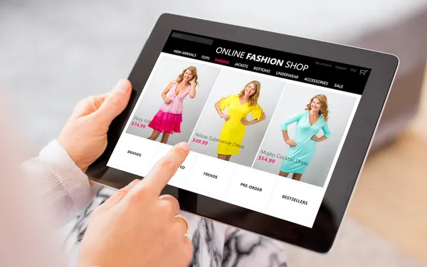
- Use a one-column, mobile-friendly theme. According to Statista, mobile commerce accounts for more than 67% of all retail ecommerce (as of 2019). That means it’s actually more important that your site looks and functions well on mobile than on desktop. So use a website theme designed for mobile, and ensure your product pages, images, zoom function and more work flawlessly on smaller screens.
- Don’t get cute with web architecture or navigation. When it comes to helping customers find what they’re looking for, it’s always best to go the traditional route. Use common page titles in your navigation bar and organize pages with a clear, no-nonsense hierarchy.
- Make calls-to-action (CTAs) prominent, compelling and tap-able. Aside from the size of the screen, the biggest difference between mobile and desktop shopping is how people select a link. When you want customers to do something (like add an item to their cart or sign up for a free trial), you have to make it easy to see, easy to read and easy to “tap” with a finger.
Step 1: Designing Your Website’s Architecture
Designing your website’s architecture is kind of like drawing up plans for a building. You have to think through how information and graphics will be framed and organized, and how people will move from one section to another. Well-designed and thought-out website architecture ensures that your content exists in a logical pattern, that website visitors can get where they’re looking to go, and that your website serves as a vehicle to move potential customers through to a purchase.
Some breeze right by this part, but it’s a vital first step — for ecommerce businesses in particular.
As we mentioned in best practices, the number one rule of website architecture is to keep it simple and expected. Customers can easily find the pages and links they’re looking for when those links are presented how and where they expect them to be.
For example, most software websites have “Features” and “Pricing” in the main navigation bar, so that’s where you’ll find them on our website. Similarly, it’s common for the blog and other educational content to be grouped under “Resources,” so that’s what we’ve done, too.
So how do you know how customers expect your website to be structured? The best way to figure that out is to go directly to the source — talk to your customers and target market. Get their insights before you build and, once built, run A/B tests to ensure your website architecture works for them.
There’s really no substitute for talking to your customers, but another way to draw inspiration for your website’s structure is to take a look at how your competitors have structured their sites. And as a rule of thumb, HubSpot recommends, “Even if your website has a million pages, the architecture should allow users to start from the homepage and end up on any page within three to four clicks.”
Step 2: Choosing a Theme, Colors, Fonts, and More
Now that you’ve mapped out how your website will work and be structured, the next step is to decide how it will look. To start, you’ll choose a theme from your ecommerce platform (for Volusion users, you can find those here). Here are a few things to keep in mind when choosing a website theme:
- Your theme needs to be mobile-friendly and responsive — there’s no compromising here.
- Some website themes are designed and tested for a particular type of website. By choosing one designed for ecommerce, you’re one step closer to a great site that converts.
- Your theme needs to allow for a lot of customizability and/or work for the website architecture you’ve already outlined (preferably both).
Once you have a theme, you can set about choosing the right colors, fonts and visual feel for your store and your brand.
Keep in mind: colors are more than just an aesthetic choice. Color can make consumers feel something and make a statement about who your brand is and what it represents.
If you’ve ever received an email written in Comic Sans, you know typography can have the same effect. There are four main types of typography on the web:
- Serif
- Sans serif
- Script
- Decorative
Typically, we associate sans serif fonts with brands that are modern and clean. Apple pioneered and exemplifies this kind of brand. Serif fonts, on the other hand, can convey a sense of authority and tradition.
As a general rule, your website should use either a serif or sans serif font (or both)—many script and decorative fonts can make your site look less professional and easily lead to readability issues.
Step 3: Taking A+ Product Photos for Your Website
In the ecommerce world, there’s simply no overestimating the power of really good product photos. Photos are the only real way consumers have to see and judge your products and base a purchase decision on.
In an episode of the How I Built This podcast, Airbnb cofounder Joe Gebbia talks about the difference high-quality photography had on consumers’ willingness to rent Airbnb listings sight-unseen. Quality photos have the same effect for physical products—and when it comes to ecommerce, high-quality photos are the real conversion-drivers.
So what makes a good product photo? Here are a few basic elements for every product photo:
- High resolution, clear, and well-lit
- #NoFilter
- Showcase the product from different angles and/or in multiple settings
As long as your product photos encapsulate those elements, you have 3 main options for making them happen:
- Take your own product photos with your smartphone
- Take your own product photos with a professional camera
- Hire a professional photographer
Design a Website That Converts
From your customers’ perspective, your ecommerce website is your business—so it’s important that your website is professional, on-brand and, above all, ridiculously easy to use. By following the best practices and steps we’ve outlined above, your store will be well on your way to a beautiful website that does what it’s designed to do: sell.
Have any questions about site design? Ask them in the comments!