Typography 101: How to Choose the Right Fonts for Your Website
Want to learn more about typography, but don't know where to start? Check out our post on typography 101 for everything that you need to know
Now that we know how important good typography is to your store's success, it's time to get into the nitty-gritty of selecting the right typefaces for your store. With so many fonts available to us, it can be hard to know where to begin. But don’t worry, because this is typography 101 and class is officially in session.
In this post, we'll check out some aspects to consider when choosing the right typeface look for your store, as well as a few typographic fashion faux pas to avoid.
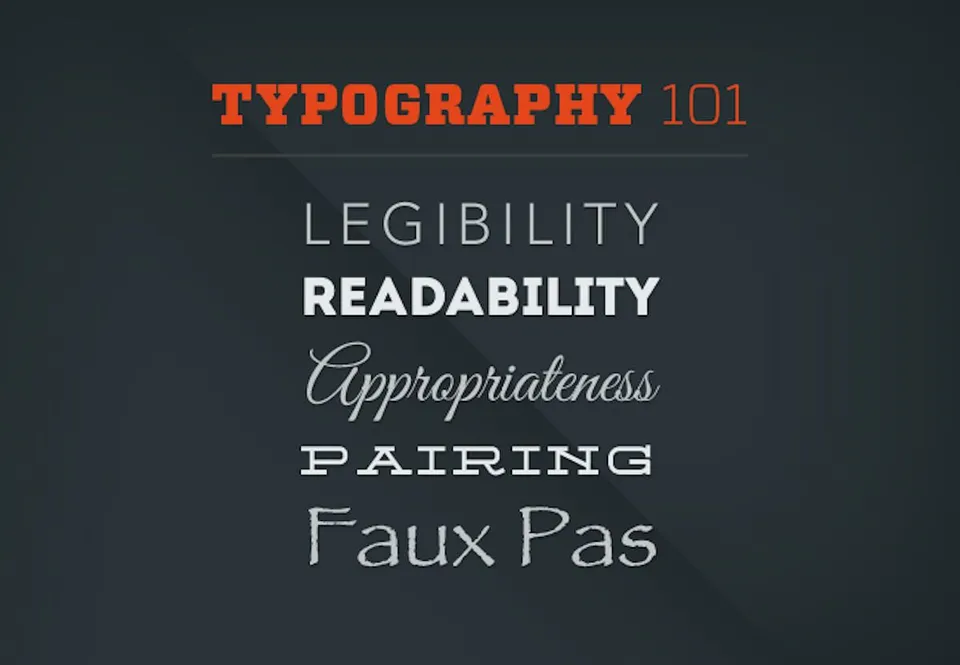
Lesson 1: Legibility and readability
Two things to consider when choosing your store’s typeface are legibility and readability. While legibility and readability sound very similar, they're actually quite different. But together, they work to effectively communicate your brand's message.
Legibility
Legibility is being able to distinguish specific letterforms from each other. (Think of a letterform like the specific structure and shape of a letter in that typeface, complete with the correct width and spacing, and any details like serifs or patterns.)
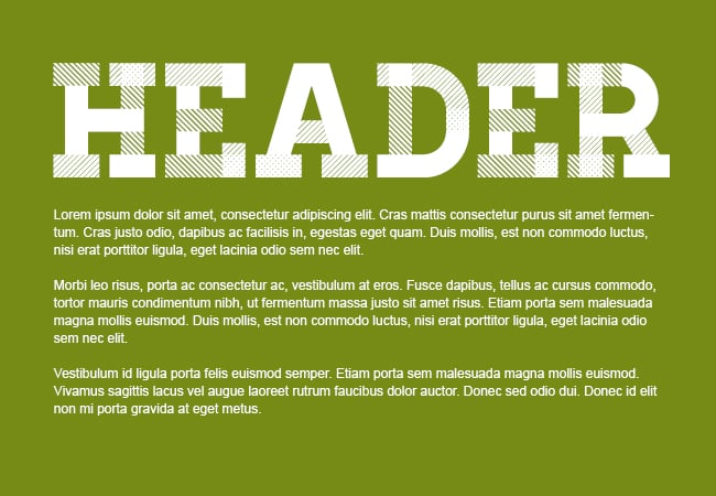
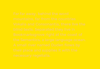
For an example of good versus poor legibility, let's look at the typeface Homestead. When it's used in a header, you can easily see all the intricate details of each letterform.
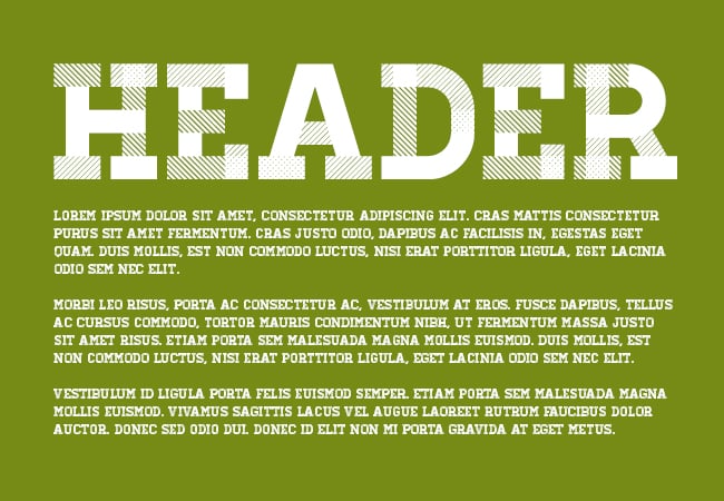
It's pretty darn legible and attractive. However, as body text, notice how fuzzy the edges are and how you can no longer see each letterform's stripes and dots. In other words, when Homestead's been shrunk down to a smaller size, it's become illegible.
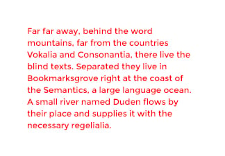
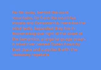
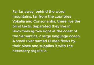
Since body copy tends to be smaller, a more legible option would be a typeface with simpler, clean lines.
As you can see, by opting for one of these simpler typefaces, we've improved legibility by leaps and bounds.
For peak legibility in your online store, we recommend using one of the following typefaces for body copy:
- Arial
- Verdana
- PT Sans
- Times New Roman
- Crimson Text
- Podkova
Readability
Readability refers to how text is arranged so that the eye can easily read the content.
There are a number of things that affect the readability of text, including:
- Line height: The spacing between lines of text. If there isn't enough space between the lines, not only will it not look as nice, but readers will more easily lose their place.
- Letter spacing: The spacing between letters in a word or group of words. Too much or too little spacing can affect readability.
- Text size: If the text size is too small, it can get pretty hairy to read. (Think old, dense college textbook.) While size often depends on what works with the design, a good rule is to never go smaller than 12px.
- Color: It’s important to think about color contrast when dealing with readability. For more about color, here are some examples:
|
Bright red text can cause reader fatigue. |
Low contrast can make words hard to see. |
|
High contrast can cause colors to “vibrate.” |
Good contrast helps the reader access the content easily. |
Lesson 2: Appropriateness
Just as you wouldn’t wear an old pair of sweatpants to the presidential inauguration, you don’t want to dress your website in a typeface that contradicts the tone of your brand or industry. As mentioned in our previous typography post, the typefaces you choose have a huge impact your website’s overall voice and mood. So when selecting a typeface, a good rule of thumb is to choose one that matches your target audience’s expectations.
For example, when you're visiting a news site like The Texas Tribune, you'd expect to see a typeface that commands a sense of authority. The Texas Tribune has wisely chosen the typeface Georgia to create that feeling.

But watch what happens when I change the typeface to a script called Grand Hotel:

Yikes, right? While Grand Hotel could work on a more playful design, it portrays the wrong mood for The Texas Tribune. (To return to our earlier analogy, this would definitely be wearing sweatpants to the White House.)
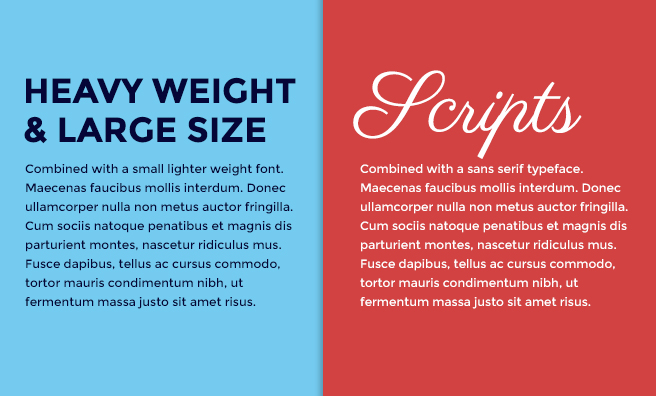
Lesson 3: Pairing typefaces
Pairing typefaces is not an exact science, but there are some guiding principles that can help you find complementary looks. One of those rules is that opposites attract and should be paired together. Two similar typefaces will actually compete with each other and stress out your readers' eyes.
Here's an example of this rule in action:
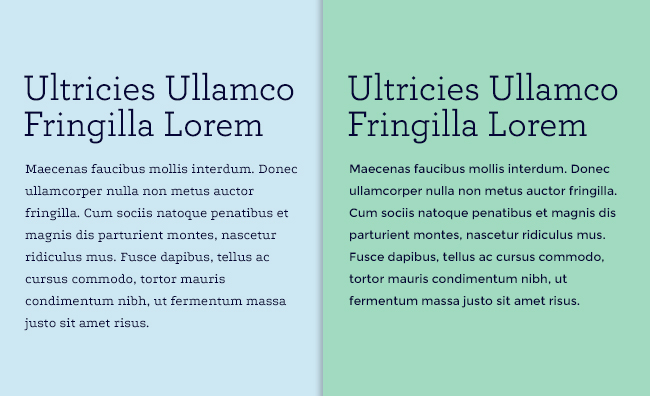
On the left, we have two typefaces that are both slab serif typefaces. While they're technically different typefaces, their inherent similarities create some visual tension that's unpleasant to see.
On the right, we have one slab serif typeface and one serif typeface, and whew, what a difference. Immediately you can tell that the tension's been relieved. That's because pairing contrasting typefaces allows each typeface to speak while still keeping the peace.
Here are more examples of opposites complementing each other:
Lesson 5: Typography faux pas
If there's a hard and fast rulebook for typography, these faux pas would be in the first chapter. Here are some typography don'ts that you should never EVER do:
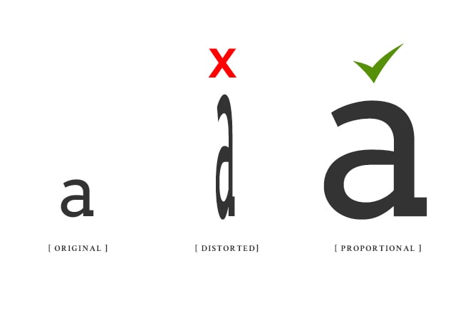
Don't mess with proportions
A good typeface should be left alone. While it's fine to make a typeface larger or smaller, it should never be compressed, stretched, skewed, or manipulated in any way that messes with its original proportions.
Never use these fonts
Sadly, there are a few typefaces that have been abused, overused, and need to be excused. They're so bad that they have the dubious honor of getting a visceral reaction from most designers (seriously—I’ve seen designers retch) and non-designers alike. For your sake and the sake of those around you, you'll want to steer clear of these typefaces.
Comic Sans
Comic Sans is a casual comic book-style typeface and was created for informal use. Widely misused, Comic Sans now lends a particular air of unprofessionalism to anything it touches.
If you’re looking for a fun, childlike typeface, try these alternatives instead:
Papyrus
Papyrus was created to look like handwritten text on Ancient Egyptian papyrus paper. Like Comic Sans, it has fallen victim to overuse and misuse. Using this typeface now gives off an unsophisticated, inauthentic vibe that no business would ever want on its site.
If you were considering Papyrus, here are some alternatives that'll make you much happier:
School's out. Time to dress for success!
While choosing a typeface can be intimidating task, you now know some simple guidelines that can help you make the right selection for your store. If you're in the process of selecting your typography or are considering a redesign in the future, we strongly encourage you to explore the wide selection of typefaces available to you.
Here are two fantastic resources for downloading typefaces:
My Fonts
My Fonts has a great selection of fonts you can purchase for your store. It's actually a favorite resource for high quality typefaces.
Google Fonts
Google Fonts is a number one resource for commercial free, web-ready fonts. All the fonts available here are free to download and use.