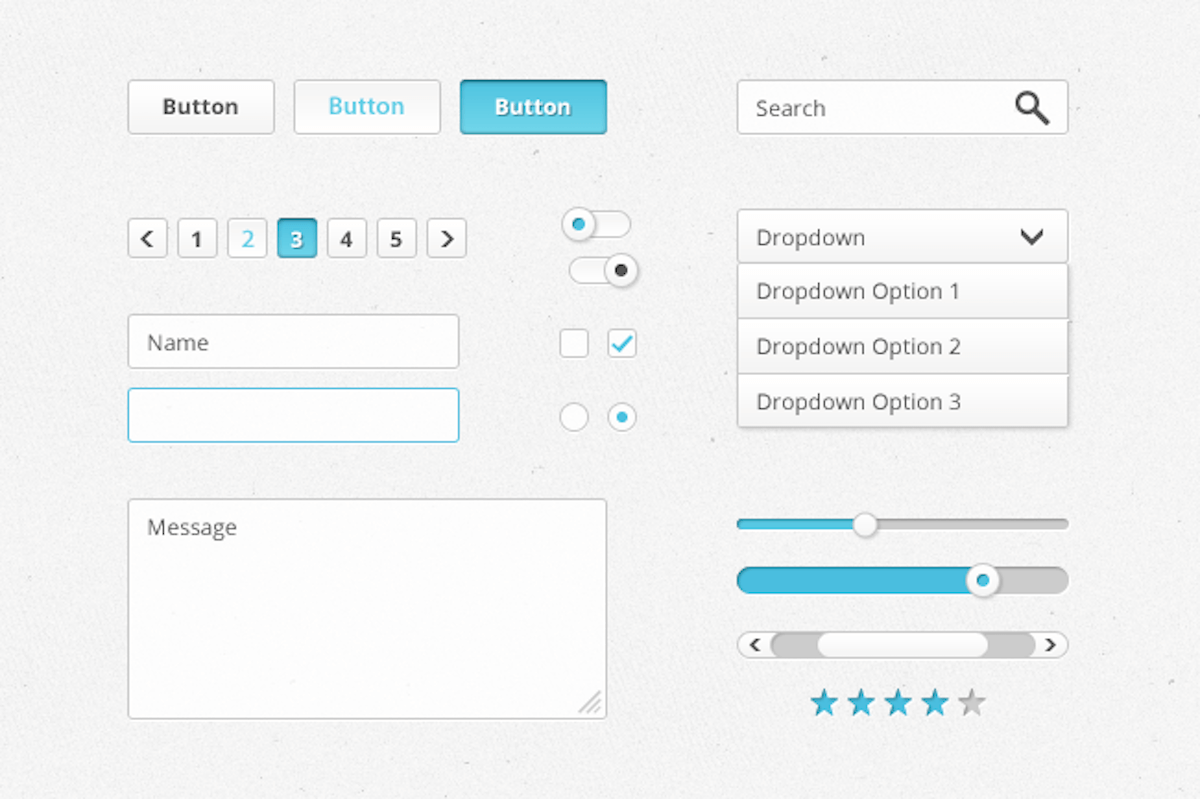
When it comes to displaying your product options, you’ve got several options. In fact, this decision makes a big impact on your site’s usability, as it helps reduce customer confusion as they add products to their cart.
While there are several formats to choose from, the three most common display types are dropdown lists, checkboxes, and radio buttons. Here are some quick tips to help select the most effective method for your needs:
Dropdown Lists
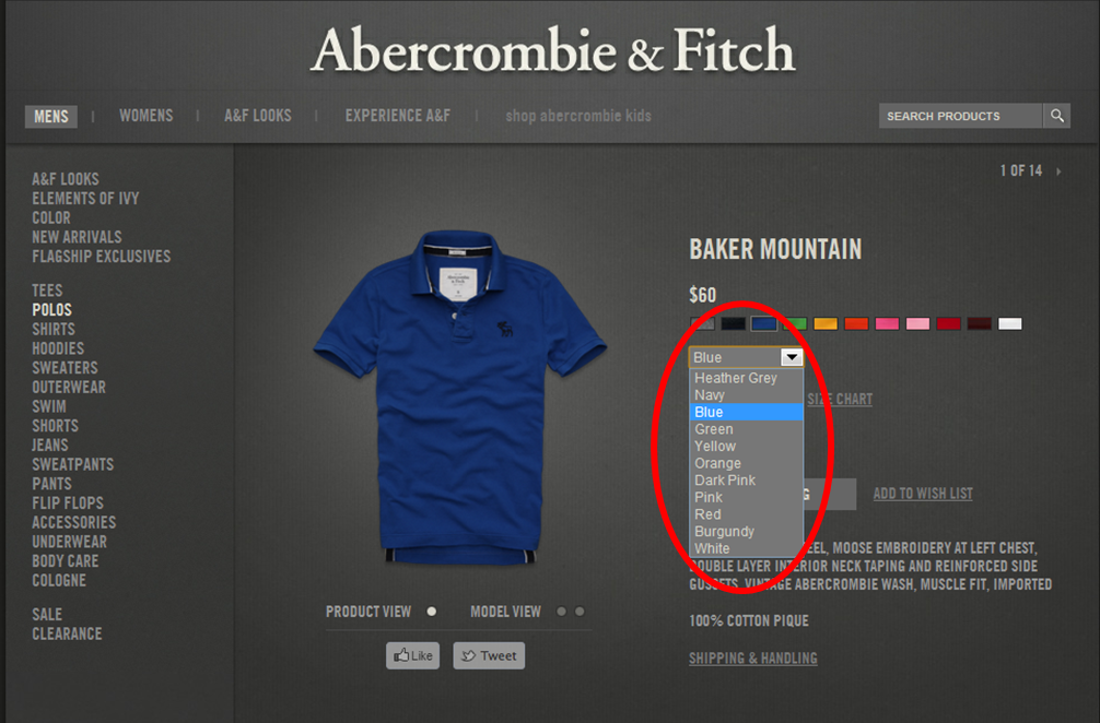
Dropdown lists are a popular format for showing product options, particularly for apparel retailers and sites that sell products in various colors, shapes, and sizes. (This is also the default display option for Volusion sites.)
Before deciding on dropdown lists, ask the following questions:
- Is the option selection mutually exclusive? In other words, is there only one option that customers can select, such as the color of a shirt? If so, a dropdown list is appropriate.
- Are the listed options adjectives or nouns? If yes, try using a dropdown list. Sizes, colors, and quantities are all good examples of this idea.
- How much space to I have to display my options? If your product has several options for customers to choose from, a dropdown list will save valuable real estate on your product pages and prevent customers from having to scroll through a long list.
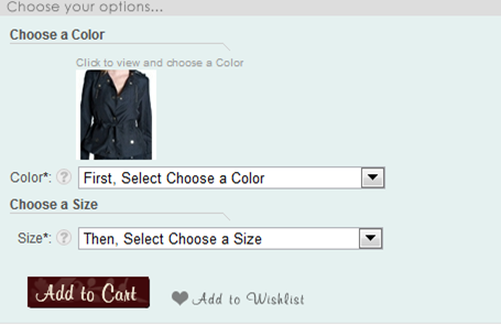
- Does the customer need to select from multiple sets of options? If your customers must select from more than one option set, dropdown lists help streamline this process while keeping the options in a simple format, like this:
Checkboxes
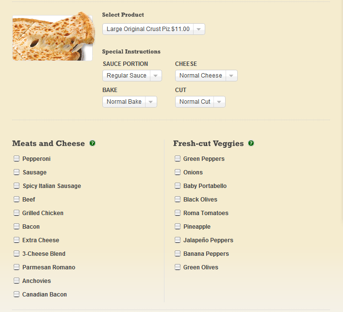
Outlining product options with the checkbox display type is ideal if your customers need to select multiple items from the same option list, such as pizza toppings, or if there’s only one option to choose.
Before deciding on dropdown lists, ask the following questions:
- Can my customer select more than one option from the same option list? Like in the example above, checkboxes are appropriate here since multiple selections can be made. But if customers can only select one option, avoid checkboxes. In the example below, note how it’s problematic for shoppers to select more than one shirt size:
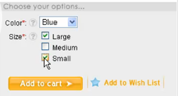
- Does my product only have one option? If your product only has one option, or if you’re trying to upsell customers by having them select only one option (i.e. “Add warranty for $9.95”), then a checkbox is appropriate because it’s less ambiguous and saves customers from making an extra click.
Radio Buttons
Radio buttons are useful when shoppers can only choose one option from a short list—Microsoft recommends using radio buttons for lists that consist of 2-7 options.
Before deciding on radio buttons, ask the following questions:
- Is the option selection mutually exclusive? Can customers select only one option? If so, radio buttons can be used.
- How much space do you have to display your options? Since radio buttons take up more real estate on product pages as the number of options increases, take into account how much room you want to dedicate to displaying your options.
- How much attention do you want drawn to your options? If you decide that outlining each of your options is a good use of space, radio buttons are appropriate. Or, if you’d like to highlight the contrast between two alternatives, radio buttons might work better than a dropdown list.
At the end of the day, the most important consideration is your customer. The end goal is to help efficiently guide them through your options without causing any confusion. By doing so, your product pages are much more likely to convert. And that, after all, is the best option anyone can hope for.
