5 Characteristics of a Great Business Logo Design
As the crowning jewel of your brand, your logo should be designed strategically and thoughtfully. Learn the top characteristics of an effective and compelling logo, and follow them as best practices
Every ecommerce site needs a great logo that accurately reflects their brand, as well as the overall personality and tone of their company. Having (and prominently displaying) a professional-looking logo is an easy way to help establish credibility and make your online business stand out from the crowd.
Whether you’re interested in updating an existing logo with a more modern look or styling a completely new representation of your business, creating a new logo is an exciting and important venture. To ensure a rewarding outcome, keep these characteristics in mind as best practices as you embark on designing a great logo for your business.
1. Simple
When creating a logo, simplicity is always key. Your logo should be concise rather than filled with graphical elements that may not really convey your brand, intention, or the overall tone of your business. Many companies create compelling logos just by using their business name, business initials, or a single, uncomplicated graphic to represent their brand. “Simple” doesn’t have to mean boring—it can still convey a lot of emotion and meaning, just in a minimal way.
If we look at the Olympics logo, we can see how “simple” goes a long way. On the surface, the logo is just five circles in different colors. However, the circles are arranged in an unusual pattern, and they all intertwine with each other. Since circles typically represent unity, this logo simply and succinctly drives the point of uniting different things together into one (for sports).

Image Source: Olympics
2. Attractive & Professional
If you want your business to inspire feelings of trust in potential customers, make sure your logo’s final product looks both attractive and professional. Your niece may be a wonderful artist, but scanning her artwork, uploading it to your computer, and calling it a logo simply won’t meet today’s visual standards. Make sure that your logo is designed cleanly using current design practices—and most importantly, that it is visually pleasing so viewers won’t want to look away.
Consider the difference between Shell’s first logo, created in 1900, and their current logo. The first logo was likely more than acceptable at the time, but by today’s standards it comes across as hand-drawn and a little choppy, evoking an unprofessional feeling. Alternatively, its most recent iteration looks crisp, clean, and attractive for today’s detail-magnifying digital screens.

Image Source: Shell
3. Meaningful
The logo you create for your business should fit your brand in a meaningful way. For example, a logo using a playful font would be perfect for a children’s clothing store, but not for a store selling medical supplies. Your logo should convey the tone and personality of your company in both color and graphical imagery. It also doesn’t need to feature what you sell to be a perfect fit—a logo is an overall impression of your company rather than an exact description.
Let’s look at Amazon’s logo. While it seems simple at first—the company’s name with an arrow demonstrating that its products are moved from one place (their warehouses) to another (your home)—the arrow’s placement is notable because it conveys Amazon’s message that they sell everything from “A” to “Z,” and the curved arrow simulates a smile to evoke happiness.
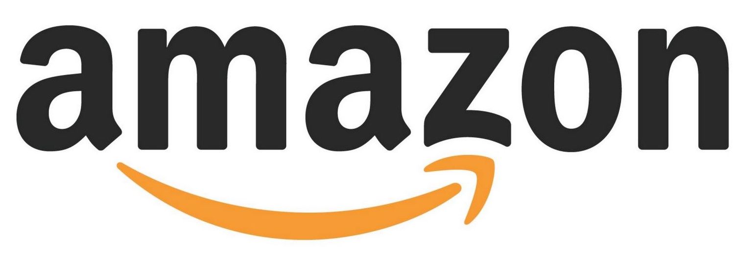
Image Source: Amazon
4. Timeless
If all goes according to plan, your business will be using its logo for a long time. While no one knows what future trends may be, you’ll want to try to make sure that your logo is as timeless as possible. Several large, well-known companies have kept their logo consistent over decades, making changes over time through tiny tweaks over the years. Most logos that stand the test of time are simple and speak to the brand, without a ton of bells and whistles.
Consider the Coca Cola logo. The company originally fashioned a logo out of their company name in a custom font, ensuring that it would stand out, and in a red color, which portrays energy and excitement. Since the company’s product, vision, and (arguably) uniqueness has remained constant, the logo has remained largely unchanged since its introduction in 1887.
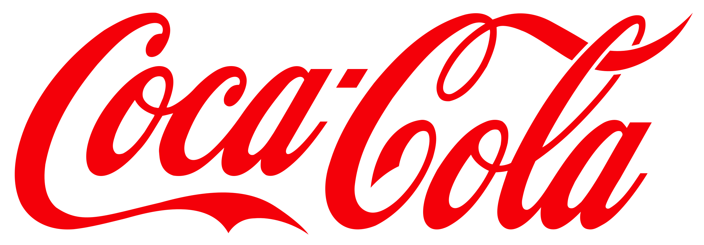
Image Source: Coca-Cola
5. Memorable
One of the key objectives business owners want to achieve when creating a logo is for the logo to be memorable to everyone who sees it. The first step to a memorable logo is to keep it simple, and the second is for that logo to be completely unique to your brand. The goal here is for viewers to know just from a quick glance what company the logo represents, and for them to unconsciously experience an overall feeling representative of your brand at the same time.
Take Nike’s iconic logo, which is easily one of the most effective logos of our time. It is minimal and visually pleasing, and the long tail helps viewers imagine the speed they can achieve by running in these sneakers. The “Nike Checkmark,” along with its catchy slogan “Just Do It,” are recognizable throughout the world because of their uniqueness.

Image Source: Nike
In Conclusion
No aspect of your visual branding takes center stage the way that a properly designed logo does. Well crafted, a logo conveys your brand's personality across all media, whether digital or print. Whether your ecommerce store is large or small, a clean and beautiful logo strategically placed throughout your site can compel even the most skeptical buyers.