An Introduction to the Power of Typography
Not sure how your website's typeface impacts the user experience of your online store? Review this quick typography intro and start building a better ecommerce business

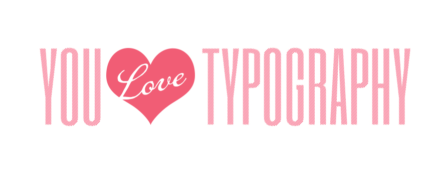
As a web designer, I’m not exaggerating when I say I love typography. Most of us design professionals do. We follow typography trends, collect typography design boards, and have heated debates about typography selection over our morning coffee. You could say we’re a little crazy about it.
Chances are, though, you don’t love typography. You may not even be 100% sure what typography is.
So we’re going to fix that.
In this article, I’m going to introduce you to the power of typography and how it impacts your online store’s success. I’ll also cover some typography basics, like the difference between typefaces and fonts, the classifications of typefaces, and how subtle typography changes can alter your store’s messaging.
Let's get started with typography and how it impacts your store:
Typography impacts your website’s voice
Repeat after me…
Power over your company’s messaging, user experience, and branding, that is.
Typography is one of the most important aspects of your website because you use it to communicate with your customers. The fonts you select can impact the entire look and feel of your store—which, in turn, can completely transform the message you convey.
For example, playful typography
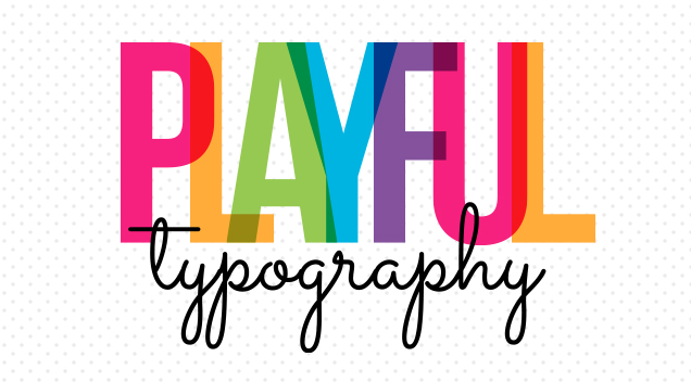
will convey a message differently from classic typography,
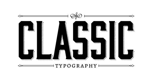
thus altering both the website voice and overall message delivered to the customer.
Typography impacts your revenue
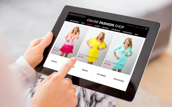
Careful control of typography is a critical aspect to your website’s success because it can determine whether you end up in the black or in the red. Wrong type choices can make a site look sloppy and unprofessional, leading to lower conversion rates. Likewise, the right typography choices can enhance and add meaning to the message you're communicating. It can also build trust, endear your site to the visitor, and set it apart from competitors. In other words, properly applied typography can enhance user experience, improve your site’s conversion rate, and ultimately increase revenue.
Basics of typography
“Typography - /tīˈpägrəfē/ - The art and technique of arranging type in order to make language visible” (Wikipedia).
The “arranging” of type involves deciding on many different characteristics including typefaces and fonts, size, spacing between the letters, color, and so on. And while we're on the topic of typefaces and fonts, let's take a moment to differentiate the two.
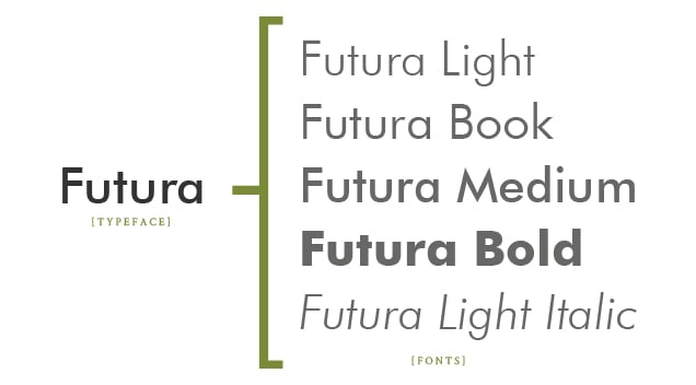
Typefaces v. fonts
Many people are confused about the difference between typefaces and fonts, and it's because these words are often (and mistakenly) used interchangeably.
A typeface is a family of fonts, while a font is a typeface in a specific weight or style. To clarify with an example, Futura is a typeface, while Futura Bold and Futura Book are fonts.
Typeface classifications
There are many different classifications of type, and no introduction to typography would be complete without covering the four most popular ones: serif, sans serif, script, and display.
Serif v. sans serif
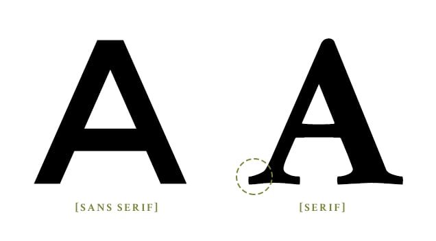
Serif typefaces have small, projecting features called “serifs” at the end of each stroke. They often look like feet at the end of each line and, from a web perspective, these “feet” can muddy the text and damage readability, especially in smaller sizes. Conversely, sans serif typefaces have letterforms without the serifs or "feet." These are the most commonly used and most highly recommended typefaces for the web because they're the easiest to read on a variety of devices.
Scripts
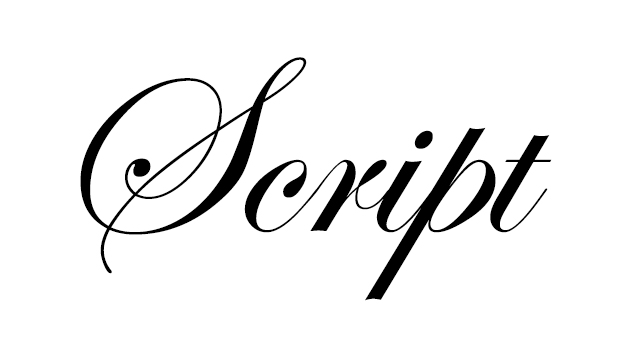
Script typefaces typically mimic calligraphy. While they are hard to read as body text, script typefaces are commonly used in logos and can be effectively applied in headers as well.
Display
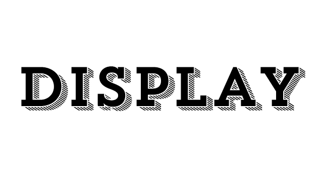
Display typefaces are intended to be viewed at large sizes, like in headers or logos. They often feature intricate details, so if they're applied as body text or the font size is too small, they tend to look messy and illegible.
Congrats!
Ok, so you might not love typography just yet, but hopefully you have a renewed respect for the part it plays in your store's success. It's important to understand that the success of your website can depend on the typefaces you choose, as those letters are the vehicle for your message to the world.
In our next installment of our typography series, we will discuss best practices for choosing the perfect typography for your site. Here on the Volusion Design team, typography is one of our favorite tools for enhancing the look and feel of a website. We look forward to sharing our passion with you and hope our knowledge will help to make your store wildly successful!