3 Landing Page Design Ideas for More Conversions in 2019
Learn how to design your site for sales

The latest design trends don’t always influences landing page conversions. Trying to trick customers with some clever pop-up or exit intent doesn’t, either.
The best way to increase conversions over the long haul is to rely on principles that have worked for the last few years and will continue to work — no matter what developments pop up in the meantime.
Here are three landing page design ideas that won’t just increase conversions today, but for weeks and months to come.
1. Lead users to calls-to-action (CTAs) with the structure of your pages.
Landing page design should begin with the end in mind.
Starting with your primary objective for that page, and then backing out to everything else, will help you keep the overall structure in perspective.
It sounds simple and trite, but organizing a landing pages’ objective around a straightforward CTA has the power to instantly lift conversions. MarketingExperiments found that simply reorganizing the CTA layout resulted in a 64% conversion boost:

Many times, this means you prioritize one option visually, while de-emphasizing the others, to funnel people into the action you want them to take. So instead of three equally-weighted buttons, you highlight one, make it bigger, and help it stand out from the other two:

You can laser-focus on the CTA by first organizing a page’s structure and main elements. Nick Schäferoff recommends two key site design ideas to pull this off:
- “Work on a different medium than your computer”: Working with pen and paper, or even post-it notes, can force you to focus on the big, structural elements without getting stuck in the weeds on unimportant details.
- “If hell-bent on using a computer to design, use the ‘squint test’”: Step away from a computer monitor or minimize the window, and squint to see the shapes. You still want to see how the page directs a user’s eyesight from one element to the next.
The result should initially look like blocks with plenty of whitespace, as opposed to some intricate design for design's sake.

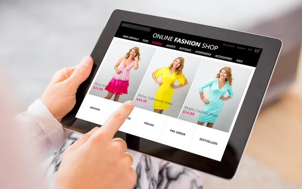
2. Use real images of people instead of fake stock ones.
You know by now the sad, pitiful state Facebook’s organic reach is in, dropping like a rock over the past few years.
You can combat this problem with interactive content types like live video, or as Volusion’s own Samantha Rupert’s already recommended, with real people:
“The best kind of content on Facebook is the kind that looks natural and feels authentic. Photos and videos of real people, doing real things, in real places drives conversions.”
The same phenomena applies today with landing page conversions as well.
This time, Visual Website Optimizer (VWO) ran a split test that compared how the conversion rate for stock images vs. images with real people stacked up. The results weren’t even close.

A massive 161% more people clicked on the initial registration page call-to-action (CTA). And then from there, another 38.4% more people ended up registering.
This test wasn’t a one-off, either.
VWO then ran another similar test, this time comparing an artist’s face with their actual work (i.e. the stuff people would be buying). The artist’s photos weren’t even overly professional or cropped similarly, and yet the conversion rate still more than doubled (from 8.8% to 17.2%).

3. Simplicity converts better than complexity.
More doesn’t necessarily mean better online. That’s especially true when it comes to how design elements affect conversion rates.
Basically, presenting people with too many options literally makes them “scatterbrained,” which creates the opposite of what was intended: less conversions.
Whereas countless studies over the years has shown that keeping things simple and straightforward can usually boost conversion rates. For instance, removing steps in a registration process to make it easier to complete resulted in more people actually completing it.

This principle doesn’t just affect your landing page CTA, though.
Clean, simple landing page designs make it easier for visitors to consume what’s on the page and know what to do next (i.e. click, buy, register, etc.).
That’s why straightforward, static design elements perform better than the ever-popular carousel slider. Too much movement and too many competing messages can backfire.
An easy hack while in the brainstorming or ideation phase is to go look at template-based designs that already perform well, and mimic the same fundamentals.
For example, you can head over to check out the product landing pages from any conversion-focused sites (like a ConversionXL, Unbounce, or Instapage). Then, check out which design elements are used on those pages vs. which ones aren’t.

This product template example has four main sections:
- Static header with only a text-based product
- The single product details with only one button CTA (“Add to Cart”)
- A product video demo
- And customer reviews.
That’s it! No other flashy elements, links out to other products or social media, etc. Instead, everything for the user is focused so they don’t get distracted or bumped off course.
Conclusion
The most complex landing pages don’t necessarily convert the best. The same thing applies to the most beautiful ones, too.
Instead, the best performing landing pages follow time-tested principles, like:
- Lead users to your CTAs with the structure of each page.
- Ditch phony, unreal stock images for authentic ones of real people.
- Keep overall design elements as simple as possible.
The best part is that following these fundamentals means your default product pages should almost always perform relatively well.
You don’t need to constantly follow the latest hacks, trends, or try to trick people. You just need to follow what works and then continually refine it to sell more products over the next year.
Have any questions about landing page design? Let us know in the comments!