Does Your Mobile Site Pass the Thumb Zone Test?
Don't make users stretch for the sale. Use these best practices to keep your mobile site design within the magical "thumb zone"
 Magaly Cardona

It's amazing how cell phones have become our sidekicks; every day it gets more difficult to leave them in a drawer at home. Activities like shopping online, checking in with family and friends, running our businesses, and social networking make mobile devices an important tool in our daily lives.
As an online seller, it's your duty to provide the best experience and support to your shoppers as they interact with your website and products. An easy, seamless experience can build trust and loyalty, which can result in high conversion rates for your business.
A customer's interaction with your website may vary depending on many factors, including customer service, the website's loading speed, the design of the site, and more. A key design aspect of user experience on a mobile device is the Thumb Zone.
What is the Thumb Zone?
The thumb zone is basically the "safe zone" on a mobile device where thumbs feel the most comfortable when interacting with the screen. The term was first coined by Steven Hoober, an expert in mobile interfaces. Hoober found that 49% of people rely on a one-handed grip to support their phones, while 75% use their thumbs to get tasks done easily.
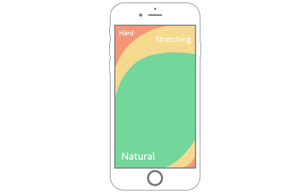
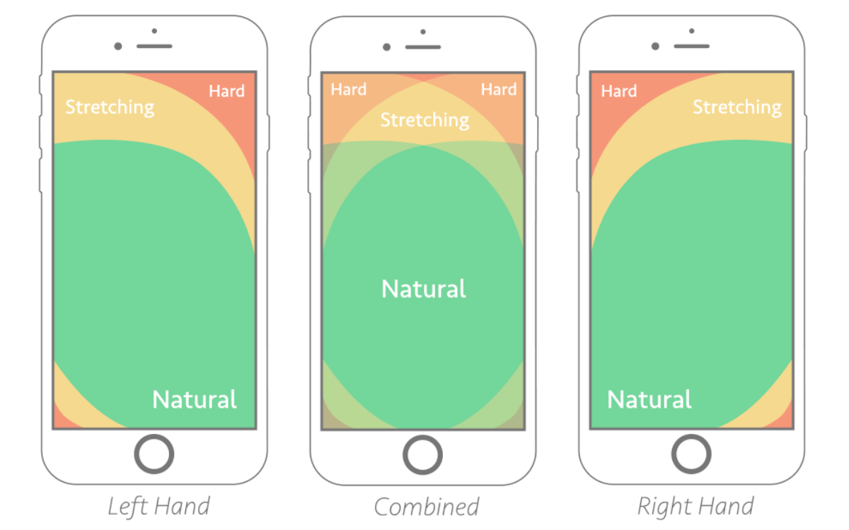
The picture above shows the thumb zone area on an iPhone screen, when the user is right-handed. The green area is the Thumb Zone—the area that's most comfortable for natural interaction. The yellow area is where the thumb stretches, and the red “Ouch” area is awkward and uncomfortable to reach for most users.
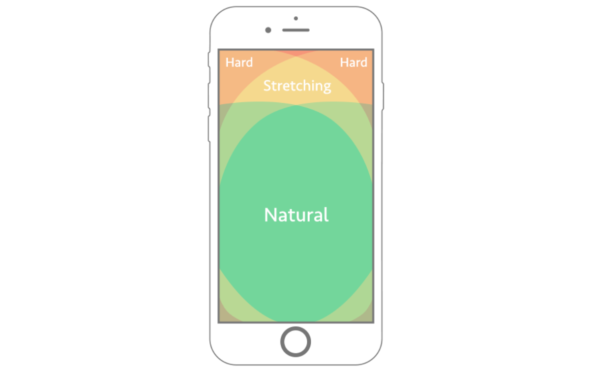
Although Hoober's definition of the thumb zone specifically refers to one-handed use, we should aim to be inclusive of those who use both hands and are either left- or right-handed. When both hands are used, the inclusive thumb-zone appears similar to the image below.
It's important to remember that even if there’s a pattern in user behavior, not everyone interacts with a website the same way. Placing the right elements in the right places on your site can play a huge part in the shopping experience your customers will have.
Another aspect to keep in mind is that the ideal thumb zone can vary depending on the size of a mobile device.
Real-Life Observations
While sitting in a waiting room, we observed the different ways in which various people held their phones and tried to extrapolate information about their potential use cases.
For example, one person held his phone with his left hand while tapping the screen with his right hand, suggesting he was either in search of something specific that needed tappable filters, or was checking off options on a list.
Another person held the phone with her right hand while scrolling with that same thumb, suggesting a quick scan through a social media newsfeed. A lower scrolling speed might have indicated that the person was reading, since we mostly try to slow down our gestures when we’re focused.
Yet a third person was holding her phone with two hands, fingers interlaced on the back for support, while both thumbs were moving all around the bottom half of the phone’s screen. Our guess? Rapidly typing a message on the phone's keyboard!
Now, what do these gestures have to do with your ecommerce website? Your customers will likely interact with your site using all these different gestures at some point during their online shopping process; knowing all the possible ways they might behave can help you perfect your website experience.
What You Can Do To Pass the Thumb Zone Test and Please Customers
Positioning
When designing a website, we recommend positioning important tasks within reach. Items that should be easily accessible include:
- popular links
- navigation menu
- back to homepage button
- call-to-action (CTA) buttons—these are particularly important for ecommerce stores, since they include actions like "Add to Cart"!
Although there are no ground rules for where to place these tasks, keeping them near the bottom center of a given page is the most reachable zone for both left-handed and right-handed people.
Having a fixed menu at the bottom of the screen is another way to keep your important tasks accessible to your customers, and saves them time during their shopping process.
Spacing
The elements on your website should have room to breathe and stand out from the page. Proper spacing helps minimize the risk of your customers mistakenly tapping the wrong link or button, which can disrupt their shopping experience. It also keeps the site clean and readable.
What to Avoid
There are many distractions that can cause a website to feel cluttered and confusing to your users.
- Parallax scrolling is a fun and trendy effect that superimposes 2 images to create a 3D appeal. Despite its aesthetics, its functionality is very low, particularly on a mobile device, because the images are not linked to pages or actions. Some customers may even perceive motion sickness while scrolling, so it's best to be careful with movement effects. Instead, consider providing more non-linked content like static images, text, or white space to avoid shopping experience distractions. Remember, if an element doesn’t add value to your site or helps bring conversion, discard it.
- Placing the shopping cart out of reach and out of sight. Now that you have a better understanding of the importance of the thumb-zone, try positioning the shopping cart within the zone at the top or on a fixed menu at the bottom.
- "Hamburger" menus are very common on responsive design. It’s usually an icon consisting of three horizontal lines that represent a left navigation. When you tap on the icon, it expands into a list of categories and other quick links to navigate from. In many cases, the left navigation opens while pushing the website’s content to the right. This tends to keep the links to the far left so that the thumb stretches trying to reach them, resulting in an awkward position. One possible solution would be to increase the size of these category links, thereby making them easier to reach. Another possible solution would be to ensure that the menu navigation covers the screen when it opens, centering the category list and making it the focus of the user's next action—without having to share screen space with other content.
Major Takeaways
Great service is all about making your customers feel at ease during their time on your store. In this age of increasing reliance on our mobile devices, designing for the thumb zone’s natural interaction with a touchscreen can be the trick to keeping loyal customers.
Always try to ensure that your website presents content in a way that keeps most gestures within the comfortable thumb zone, avoiding awkward stretches and misplaced elements.
Remember, sometimes less is more. The best strategy to avoid a distracting experience is to keep your site design clean and uncluttered. Aim to offer a straightforward and user-friendly shopping experience that invites your customers to come back to your store.

