How to Build a Better Add to Cart Button
"Add to cart" buttons are the one thing all transactions have in common. Check out this post to see how you can make this button attract more clicks for your ecommerce store
What's the one thing every customer has to do to buy your products?
It’s simple: Click that infamous “add to cart” button.
Although it may seem like a minor detail, your add to cart buttons are critical to your success. You'd be surprised at how much a simple design change can improve conversion rates and affect the overall shopping experience of your store.
So how do you build the best add-to-cart buttons the world has ever seen? For starters, follow these three design tips that will set your buttons on the path to more clicks:
1. Use color and contrast to make your button stand out
There’s been a lot of talk about which color is best for your add to cart buttons. In one corner, we have people saying red converts best, and in the other, there are those who swear that green will turn your button into a lean, mean conversion machine. The truth is, however, that they're both wrong. There isn’t a “one color fits all” solution.
Instead, think of choosing your button color in terms of visual contrast. The color that converts the best is usually the color that stands out the most from your site's background and color scheme. For example, if you use a lot of red in your site’s color scheme, a green add to cart button would contrast well and have a better chance of receiving more clicks than a red button would.
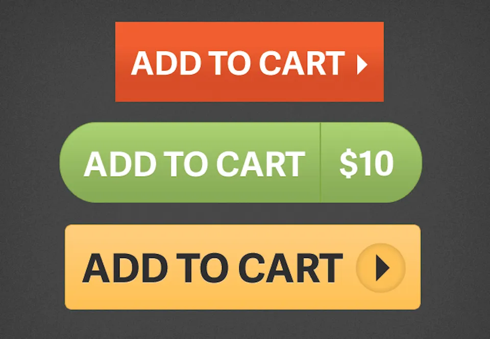
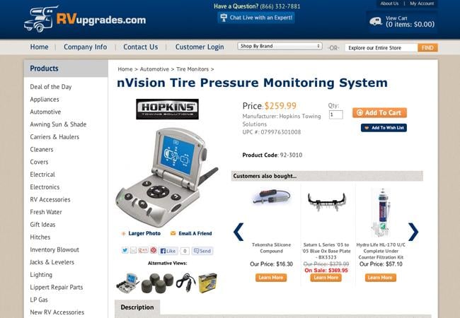
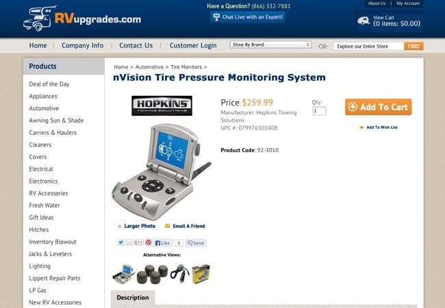
Take a look at the add-to-cart buttons in these examples to see what I mean:
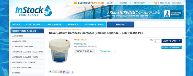
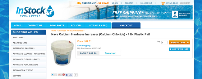
The first image’s add-to-cart button blends in with the other elements of the page, while the second image’s button contrasts strongly with the surrounding elements and stands out. That second example, with its visual contrast, is what you want to mimic with your own buttons.
Pro tip:
Use the color wheel to help find a high contrast button color.
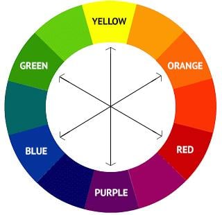
The color wheel shows all three primary colors, with their complementary colors located directly across them. Those complementary colors are also the ones that contrast the most with their primary counterparts. For example, the highest contrasting color to blue is orange, which is another reason the orange button stands out so well in the example above.
2. Make sure your button is large enough and has adequate space
You know that saying, "The bigger, the better?" That definitely applies to add to cart buttons (up to a point). In general, the larger a button is, the more likely your users will notice it and be compelled to click. That doesn’t mean your button needs take up half of the page, however. You just want it large enough that it'll stand out from other elements on the page.
If your product pages use large fonts and images, your add to cart button might need to be larger than a site that uses smaller fonts and images to ensure that it’s noticeable. Also, adding extra spacing and removing clutter around the button will help grab more attention and generate more clicks.
To see this in action, let's look at an example. Which of the two add-to-cart buttons below does a better job of grabbing your attention?
I think we can agree that the second button wins. It's larger, doesn't have to compete with as much clutter, and has more spacing between itself and the elements that are near it.
Pro tip:
See if your button stands out is by taking the “one-second test.” Look at your product page and ask yourself: "What do my eyes focus on within the first second of looking at this page?"
If you perform the one-second test on the second example above, you probably focus first on the product photo and then on the add to cart button, in a left to right motion. You might even look at the button first, which is great.
On the other hand, when you perform the one-second test on the first example, where do your eyes focus? Chances are, you focus on the product image, and then don't know where else to look. That's because there isn’t enough size difference and spacing around the add to cart button to let the viewer know where they should focus next.
3. Utilize design details
If you want your buttons to get clicks, they need to look like buttons, so use design details to make that clear from the get-go. Features like a subtle gradient, shadow, or better yet, an arrow, subconsciously tell your customers "Click here!" by drawing the eye and indicating that there's something more for them to do.
Like the other tips, this rule is best illustrated with an example. Which of these two buttons do you find more interesting?

Button A has a simple flat, solid color with zero additional design detail. Button B, on the other hand, fades from light to dark green and has a slight drop shadow, border, and arrow. Its design makes us wonder: What would happen if we hovered over it? Or better yet, clicked on it? (Well, nothing in this case, but it's the thought that counts.)
Pro tip:
Try using an arrow. This shape, in particular, has been shown to increase how often a button is clicked. The reason behind the arrow’s success is that it implies that clicking the button will take you somewhere else. This is good, because it also signals to your customer that they don't necessarily have to commit to purchasing right then and there. All you're asking is for them to take the next step...which then often leads to a purchase.
Booyah!
There you have it. If you want more of your customers clicking your add to cart buttons, you should design them in a contrasting color, make them large enough to stand out, provide plenty of space around them, and add some design details.
So what are you waiting for? Go create some bigger, better, bolder, brighter buttons. And don't forget to link to your site and show them off in the comments below.