Ten Best Practices for Ecommerce Landing Pages

A landing page is your opportunity to make a positive first impression with a prospective customer. It's important to get it right. Here are ten best practices for ecommerce landing pages so you can make the most of every visit.
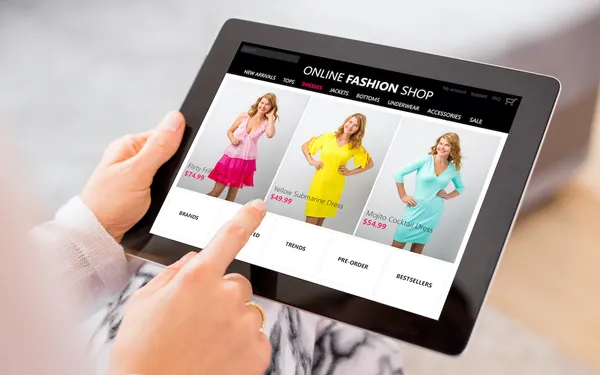
Landing pages are often the first point of interaction between ecommerce brands and potential customers. They can be created specifically to maximize the return on paid ads, email newsletters, social media campaigns and even organic search traffic. The main purpose of the landing page is to deliver a clear message and give the visitors enough relevant information to engage with the brand and ultimately convert. “Conversion behaviors” can be anything from purchasing a product or service on your site to signing up for a coupon code or newsletter.
So how do you create effective ecommerce landing pages? Everything needs to be considered from the design of the page, to the content, to the call-to-action on the page. Here are ten best practices that will help you get started right way:
- Have a clear goal in mind and define the purpose of the landing page and where and how it is going to be used.
- Use a catchy primary headline that tells the visitor immediately what the page is about and to also ensure that it’s relevant to their initial search query.
- Create persuasive content that differentiates and explains the advantages and benefits of the product or provides solutions to common concerns regarding a problem. Bonus tip: Use customer testimonials to provide authenticity.
- Ensure that your content is easy-to-read and eye-catching by breaking it into two or three easily digestible segments with compelling headlines, using numbered lists and bullet points when possible.
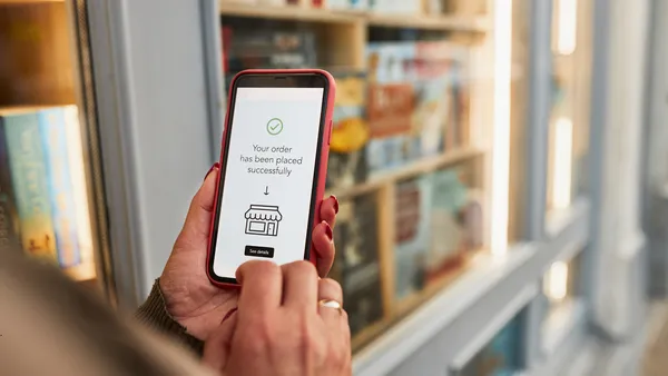
- Include a powerful call-to-action (CTA) button with a sense of urgency and repeat it in several locations on the page to encourage conversions. It is a good idea to include at least one CTA above the fold. A few examples of good CTAs include “Buy Now,” “Learn More,” or “Add to Cart.”
- Make your landing page visually appealing by including relevant images. You can also include videos, graphs, tables or other media forms, too.
- Proofread and edit your copy for grammar and spelling errors—this is important.
- Make the landing page design similar to the overall look and feel of your website so customers can connect to your overall branding and messaging. Use contrasting colors for your CTA to draw the eye’s attention.
- Include social channels so that the customers know they can reach you directly with any questions.
- If you are collecting personal information, use a short form for the most important details. Establish trust by including a privacy and security statement.