How to Effectively Design Social Media Posts for Your Ecommerce Store
Running an ecommerce store is hard enough without having to worry about managing social media. This post will provide you some concrete, actionable tips you can use to spruce up your store’s social media.
If you read Volusion's recent post on how to create a flawless style guide, you’ll have a great starting point from which to start implementing some of these tips. If not, we’d suggest checking it out first!
Using image-based posts
Assuming your store sells an item that is visually appealing, inspirational or otherwise photogenic, using image-based posts can be an excellent way to get products in front of consumers.
While that may seem like common sense, how you design your image posts is not something most shop owners spend too much time thinking about. That can be a huge mistake. While taking a quick picture with your iPhone is a great way to expediently create a social media post, it is not necessarily the best way.
So how do you optimize your image posts for conversions? If possible, craft your image in a way that will spark conversation.
So many stores just throw up a simple, head-on shot of a product and then wonder why their post didn’t get as much engagement as insert-competitor-name-here. Well, the simple fact is your competitor probably designed their post in a way to spark engagement, conversation or their social metric of choice.
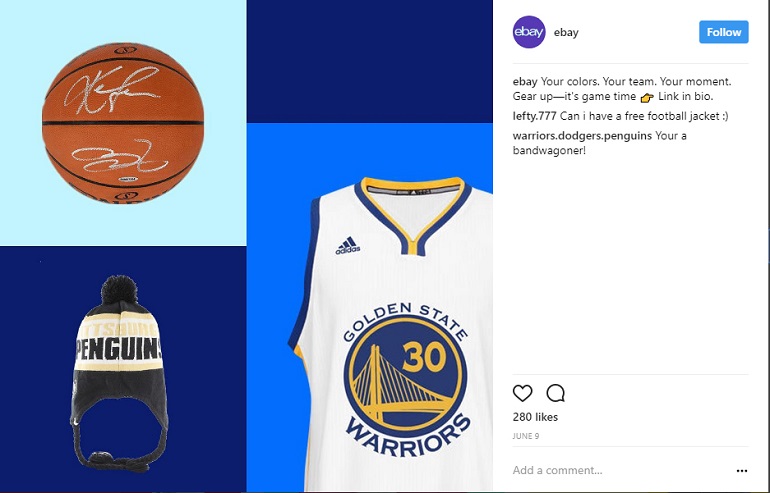
You can spark conversation in a few different ways. The easiest way is to craft a post with two diametrically opposing products/images/ideas and then ask people to choose their favorite. This not only increases engagement, but can also be a good way to see how your audience leans on a particular product or brand.
Let’s say you sell painted custom skateboard decks. Despite that probably being an inherently interesting thing to post on social media, there are a few quick tips you could do to increase engagement.
Post a 2x2 grid that includes four different skate deck designs you created and ask people which one is the coolest. Bonus points if the decks are painted to include something inherently buzzworthy like opposing movie franchises or sports teams.
Another good option is to post a before and after photo set showing the behind the scenes process of creating one of your custom designs.
A behind the scenes post can either be done in one post or via a series of posts. A suggestion here would be to add text to the image highlighting important parts of the process.
If you sell other people’s products, see if they have product imagery that you can modify for your campaigns. This is a good way to get high-quality posts that provide a pseudo-custom look to your page.
Many companies' style guides don’t cover social media image posts in much detail, so you're going to have to design those posts without much guidance. A basic color sheet and some logo guidelines may be all you get.
If your company does offer image post guidelines, follow those as closely as possible while trying some of the tips mentioned above.
Follow your company mood board if one is provided. Whether you use a mood board or not, the process of image design goes something like this:
- An image post is requested for a new product launch
- Post is designed
- Post is approved, everyone on the team is excited about it
- It gets posted and everyone realizes it looks nothing like any of the other posts on the page
- Team is sad. Boss is sad.
Luckily, this scenario can be easily avoided. Before posting something of this nature, temporarily add it to your mood board and see if it looks out of place.
The most glaring mistake here is usually the color tones. If the majority of your store’s posts use a blue hue, your new red post is going to look terrible.
Using graphic/designed posts
Generally speaking, graphic posts do well for contests, quotes or as a supplement to predominantly image- or video-heavy content.
If your store sells digital goods, designed images are going to be your best bet at getting that ever-elusive conversion. The great thing about digital products is that you aren’t constrained by the normal limitations of a physical product - you can literally Photoshop your product into any scenario imaginable.
The biggest tip when designing a post is to be cognizant of the network for which your post is being designed. Likewise, if the post is being used across multiple networks, be aware that each network has different size and resolution requirements. Either consult a social media resolution guide or test your post across all networks before going live.
Let’s use an example to show a few best practices.
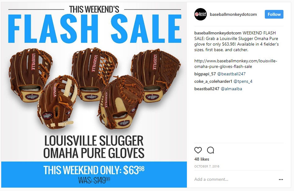
In this example, you are the owner of an e-commerce store that sells baseball equipment and supplies. In the slow winter months, you want to increase engagement on your social media profiles in order to see a boost in sales once baseball season starts.
In order to achieve this objective, you've decided to design a series of posts that revolve around “This day in the history of baseball”.
So how would you go about designing these posts?
First, work on designing a template in your favorite graphics app or utilize an unlimited graphic design service. This template will serve as a standardized way to make sure all your posts look consistent across your series of posts. Second, decide how to want your post to look. If you have a company style guide, now would be a good time to consult it.
In this instance, we’d likely use a baseball-related image as the background of each post with a text overlay on top of that image. The text would include the fact, any additional info and possibly a small logo below the fact.
The last step would be to post your graphic and test the results. If it does well, awesome! If it doesn’t, try to figure out why. Maybe the fact wasn’t very interesting. Maybe you should’ve used a solid color background instead of an image. All of these variables are testable, so make any changes you feel are necessary and try again.
The good news here is that the vast majority of company style guides will have just about everything you need in order to craft a post that will look good and, more importantly, be consistent.
Generally speaking, graphics posts will have heavier use of text than image posts. This means you need to consult the Typography section of your company’s style guide or provide the information to your designer.
A top tip for social media posts on platforms such as Instagram, Twitter or Facebook is to use text that is bold, big and easy to read. This likely means a sans-serif font that can be digested within a few seconds of viewing the image. If your style guide suggests a font that is hard to read, you may want to consult with your manager to see about making an exception.
For most posts, using your company’s suggested colors will work just fine. However, there is a fine line between keeping colors consistent and making things look boring.
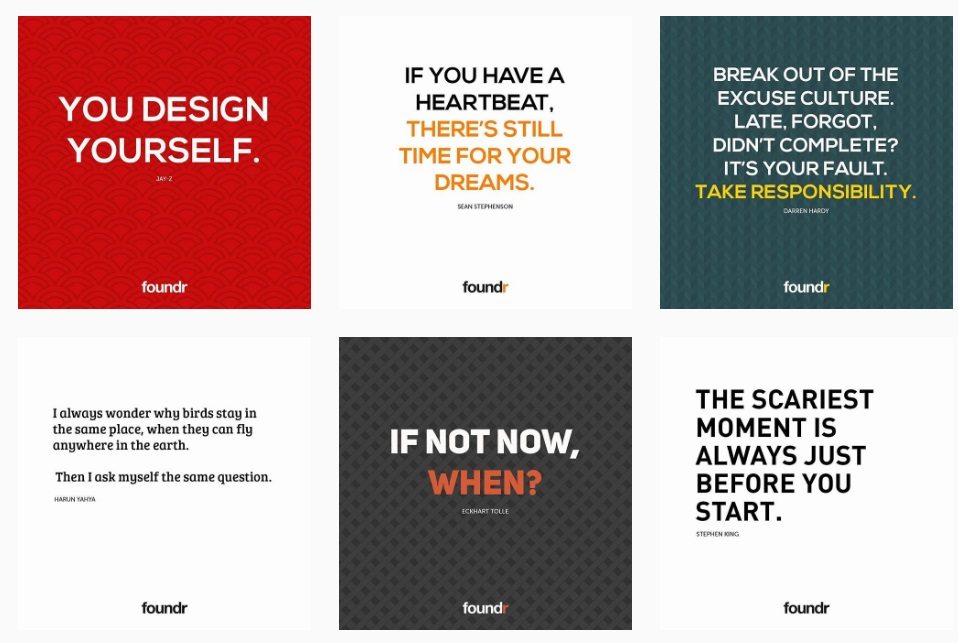
Take a look at an Instagram page like @Foundr. They use the same basic style for all of their posts - the font choice, layout and style is essentially the same. Their page isn’t boring though.
Why?
Because they implement a varied used of color. Most posts use a simple white background with dark text, but every fourth post or so they will use a bright, bold color. It’s a tactic that has helped them reach over 1 million followers.
Wrap Up - now what?
Creating social media posts for your store can be difficult. It may seem a little overwhelming with so many options out there. The most important thing to remember here is to experiment with what works for your brand. The example tactics we provided work well for the companies that use them, but they could fall flat for your store. All you can do is give them a shot, and then adjust. Go out and create a few posts using some of the ideas set forth above and see how they do for your brand!