Ecommerce Font Pairings That Look Good Together
The right fonts can make or break your online marketing. We outline the best font pairings for ecommerce sites—all free via Google Fonts
There’s no denying it: just like people, some fonts work better together than others. But how can you decide which font pairings are conversion-boosting powerhouses, and which ones leave the viewer wanting more?
Finding the best font pairing for ecommerce isn’t an exact science, but a general rule designers like to follow is this: opposites attract. Two fonts need to have enough visual contrast to pair well together. Using attributes like color, size, weight, and classification, you can create a pairing of opposites that adds intrigue and texture to your design. While not all complementary pairings follow this rule, it's usually a good place to start.
Here are a few examples of wonderful ecommerce font pairings using a free font resource we love, Google Fonts. To get the most out of these font pairings on your own ecommerce store, try using the more complex font for headings and the simpler font for body text or subtext.
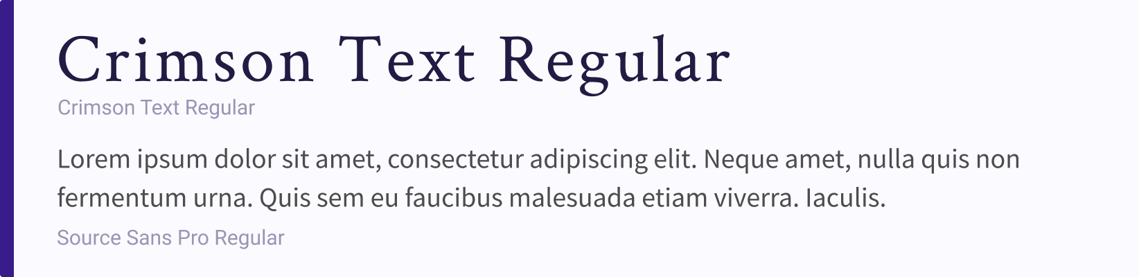
1. Crimson Text Regular and Source Sans Pro Regular
Combining a sans serif with a serif font is one of the most popular styles of font pairing. Here, we’re using a serif font called Crimson Text with a sans serif, Source Sans Pro. This classic pairing has a calming effect on viewers, so it works great with skincare, spa and yoga, and other relaxation-based ecommerce sites.
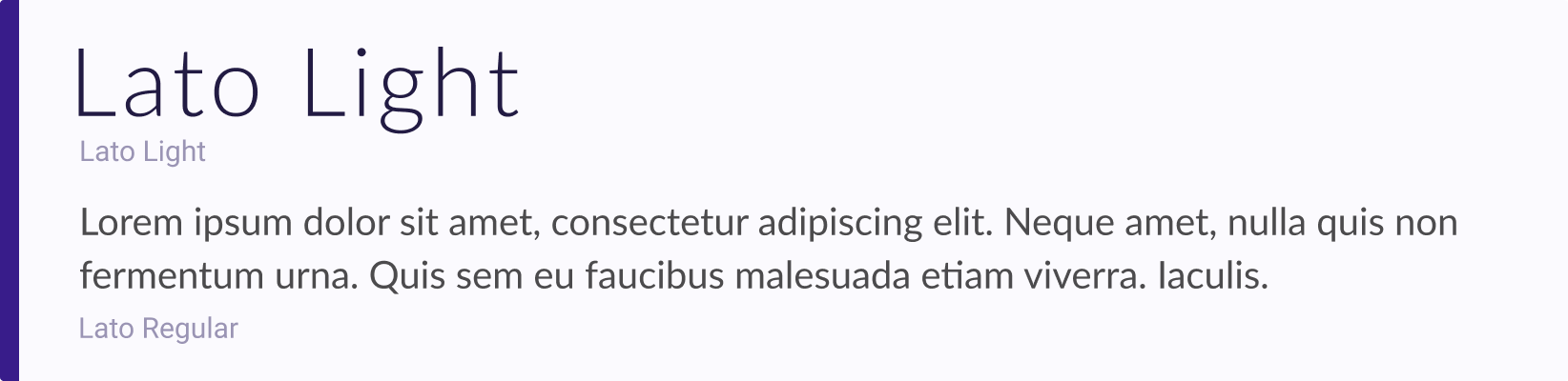
2. Lato Light and Lato Regular
Sometimes using different fonts in the same family can also work— just make sure you create adequate visual contrast between the two. For a sleek look, try Lato Light in a bigger size with Lato Regular in a smaller size. This combination works best with fashion and jewelry ecommerce sites.
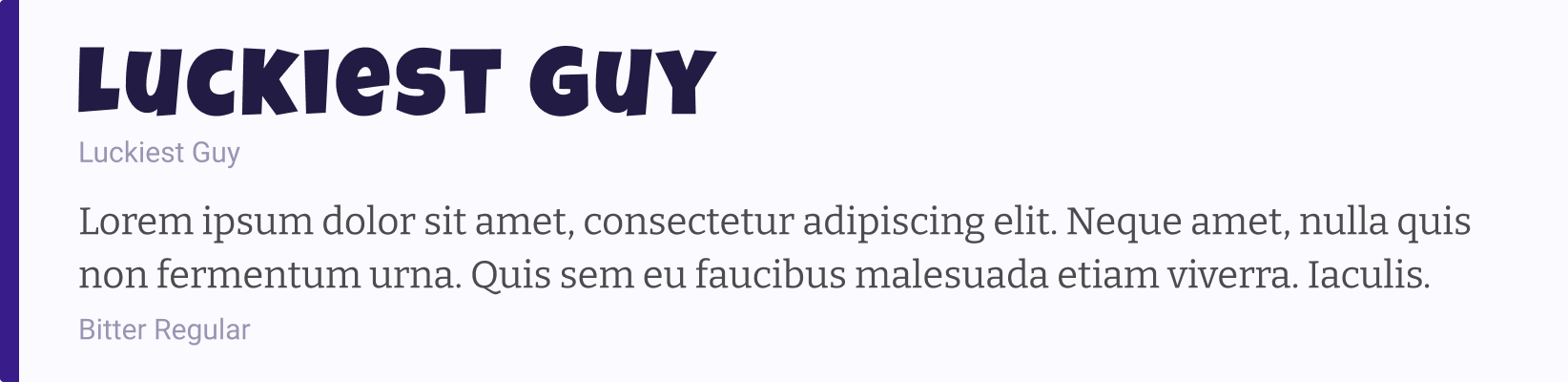
3. Luckiest Guy and Bitter Regular
For more fun and playful sites, you might want to choose a display typeface that showcases your brand's youthful personality. Here, we’ve used a playful typeface called Luckiest Guy in combination with a slab serif, Bitter. This font pairing works best for ecommerce stores selling products for children.
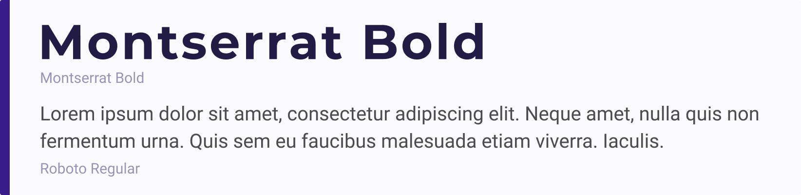
4. Montserrat Bold and Roboto Regular
Sometimes you just need a clean, minimalist font pairing. Montserrat Bold is a heavier font that works well with the lighter Roboto Regular. While these two sans serifs aren’t exactly opposites, you can adjust their weight to create more contrast between the two fonts. This pairing is best for ecommerce websites selling electronics or industrial parts.
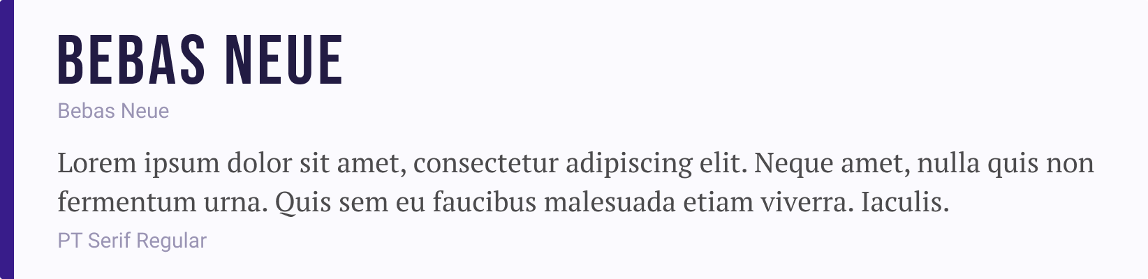
5. Bebas Neue and PT Serif Regular
For another classic pairing between sans serif and serif fonts, try combining a bold weight in the sans serif font, Bebas Neue, to contrast against the lighter weight serif font, PT Serif Regular. For ecommerce sites, this font pairing is versatile enough to work across many different industries.
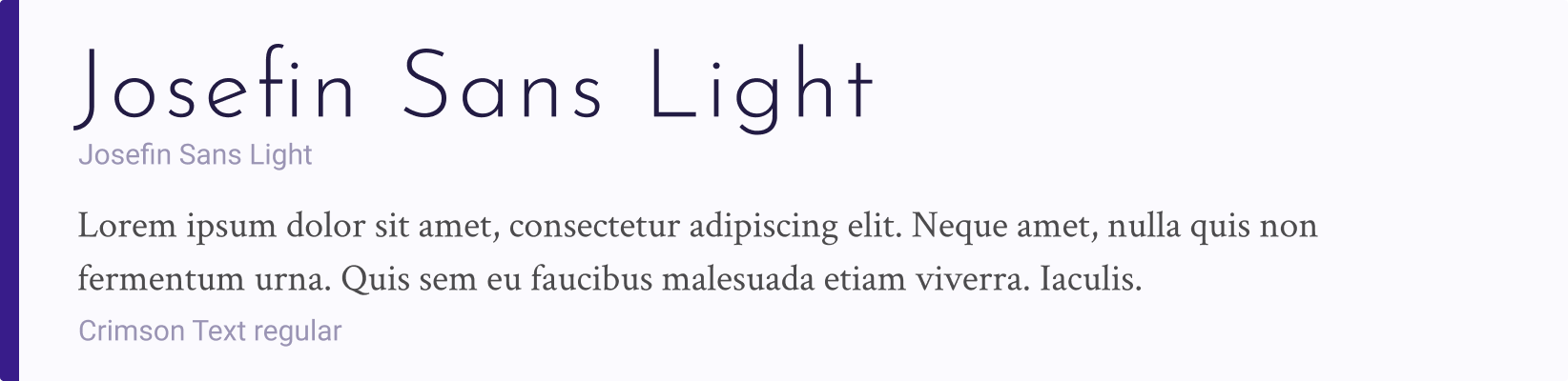
6. Josefin Sans Light and Crimson Text
For a calming and sophisticated look, try pairing Josefin Sans Light with Crimson text. The thin letterforms in Josefin Sans create an airy feel, while the serif font, Crimson Text, adds a classic and professional touch. This duo works great on stores selling makeup, jewelry, or skincare.
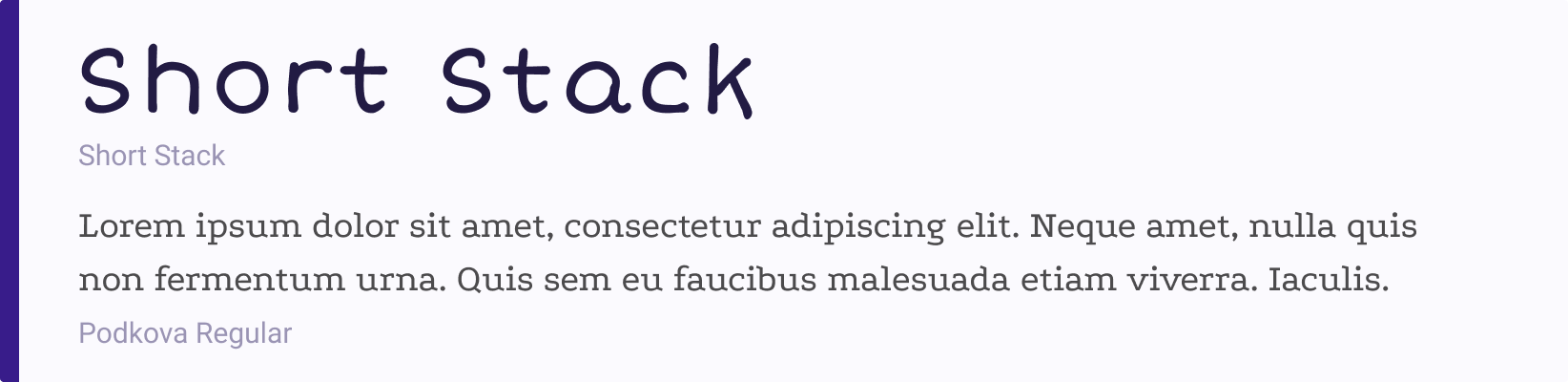
7. Short Stack and Podkova Regular
For a fun and playful look, try pairing Short Stack and Podkova Regular. These fonts work together to create a lighthearted mood that would work well on stores selling children’s products.
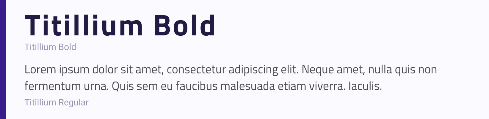
8. Titillium Bold and Titillium Regular
Sometimes using the same font in different weights can give your store a much-needed personality boost. In this example, we’ve paired Titillium Bold with Titillium Regular. Titillium’s blocky letters give off a strong, masculine feel, and the contrasting weights create essential hierarchy. This font pair would work great on stores selling automotive or industrial parts.
In Conclusion
Now that you have a good feel for some beautiful font pairings, try testing one out on your own store—but always remember, fonts should also compliment your logo to evoke the desired mood and feeling of your brand. Interested in coming up with your own font pairing? Use size, weight, and classification to guide your choices, and remember the golden rule: opposites attract.