DIY Responsive Design Part III: CSS and Image Best Practices
 Kyle Carter

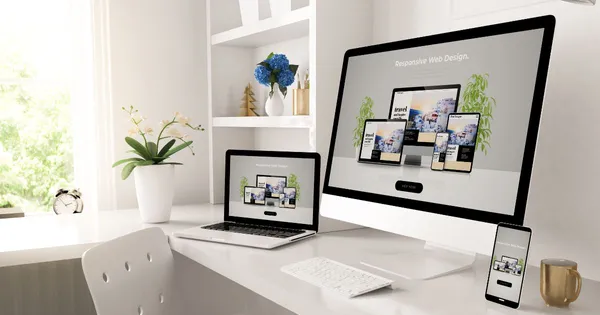
In the third and final installment of our DIY Responsive Design series, we’re going to dive into CSS and image best practices, and show you how to get a beautiful website that loads quickly across multiple devices and networks.
Namespace Your CSS Rules
Namespacing is the concept of creating a parent wrapping element in the HTML that is referenced in CSS, so styles are only applied to the wrapper element’s contents. By namespacing content it is less likely that styles needed for your article page will affect other parts of your website.Understanding this requires a discussion of CSS selectors. For CSS to know which elements get certain styles, you will create CSS Rules. A CSS rule contains a selector (i.e. the element that will receive the styles) and the style definitions.
CSS selectors can be defined as a string of text representing the parent and child relationship of an HTML document. But how does this apply to the namespacing concept?
Take these two simple CSS rules:
p {
color: green;
}
.myArticleWrapper p {
color: red;
}
In this example the first CSS rule will make all paragraph tags the color green, while the second rule will make all paragraph tags inside of an element with the class myArticleWrapper red.
Your site’s responsive template has a collection of rules and styles to ensure the best presentations across the most number of devices. Things can go wrong if CSS rules are made that affect these styles. By wrapping your article page content in a wrapper and writing your CSS rules to target only content inside that wrapper element you can avoid creating CSS that changes the styles of other elements within the responsive template.
Pro Tip: HTML class names and id attributes can be anything you want them to be. To help you and others understand your class and id values, try to make them something meaningful to the content they represent.
Add Styles to Make Images Responsive
Since browsers treat images as inline content, there may be no controls set to constrain images to the content areas they fit in. This means that CSS rules may need to be utilized to ensure images respond correctly to different screen sizes.Responsive templates typically have the img-responsive class included in the style sheet. This class can be added to an image tag to ensure images never display over 100% of their containing element.
For example: <img src="PathToImage/image.jpg" alt="my image description" class="img-responsive">
You can define a CSS rule within an element namespace to keep images responsive as well. Typically, it’s good practice to set images with a max-width of 100%. Setting exact heights and widths to your images could cause undesired presentation issues. It is better to provide percentages with width and height. This allows the browser to dynamically adjust the image size to respond to available space.
Size Images Properly
There are two factors to take into account when dealing with images: the image file size and the image dimensions. Try not to confuse the two, as the image file size represents the amount of hard drive space the file takes up; while, the image dimensions are its width and height.It is extremely important to pay attention both of these factors when dealing with images. Image file sizes will affect your page load time, while image dimensions will affect how the image looks on the page. The two most important things you can do when creating images for your articles is to save the image for web and devices and crop the image to fit in the desired display space.
Before adding an image to your site use tools like Photoshop or Gimp to save a copy of the image with a reduced file size. These tools will ensure you can get the best quality image at the smallest file size.
Try to crop images so the dimensions are similar to the space the image will fit. Meaning: if the image is going to fit a space where it needs to be wider than tall, crop the image in the same way.
Basically, you want the aspect ratio of the image dimensions to be close to that of the space it will appear on the page. Browsers try their best to display images at a decent quality, but depending on the dimensions of the image and the space it is in, the final result could end up with a stretched or squished look.
Utilize the Display CSS property
While working on your page, it may become important to display items inline on a single row, stack them on top of each other or hide them entirely. The CSS display property allows you to adjust how the browser treats an element’s staking property. The display property values of block, inline-block and hidden will allow you to stack, flow along a line or hide elements on a page.Use media queries in conjunction with this property to aid in adjusting content based on various screen sizes. It is fairly common to use the display property to force content to display inline on large screen devices, as staked blocks on phones or to hide icons for desktop screens and show them on mobile.
Set Widths as Percentages
Percentage-based widths allow pages to expand and contract to fit various screen sizes. Browsers honor exact pixel values when used to define widths and heights on CSS. This means that an element set to 800px wide will always appear at that size. Browsers will not scale that content to fit a smaller space. Because of this, we recommend defining widths as percentages.A common CSS trick that takes advantage of this concept is using the max-width property to control an element on larger device screens. For example:
.myElement {
width: 100%;
max-width: 800px;
}
This rule tells the browser to make the element fill the screen up to 800px. This way on larger screen devices with plenty of screen space the element will be 800px wide but on smaller devices like phones the element will be 100% of the available screen space.
Height values, on the other hand, are a little tricky to work with. Due to the scrolling nature of web pages it is highly uncommon to set a height value on page contents. Because of this, browsers tend not to store a lot of height information about the elements on the page.
This causes a percentage based height to appear to not have an affect on the presentation of an element. For percentage based heights to work, elements with the percentage height need to be the child of an element with an exact pixel height. We encourage only setting a CSS pixel height sparingly.
Utilize Browser Inspection Tools
All web browsers come with a set of debugging tools to help you troubleshoot problems on the page. These inspection tools can be used to see what styles an element is inheriting and also to turn on/off or add additional styles. When all else fails, try using the inspection tools to help you understand what the browser is doing when showing your content.Conclusion
Effective responsive design is quickly becoming a necessity for all websites. By investing the time and resources in your business you can improve user experience, SEO, accessibility and much more. The tips we outlined should make creating responsive pages within your template a relatively painless and fun process.Keep in mind the major ideas, including namespacing your CSS styles to a wrapper element, utilizing the Bootstrap grid and breakpoints, sizing and styling images to fit their content areas, using the display property to adjust page presentation and controlling page content sizes with percentages to get you started. As always, our Design Services team is available for custom and template design services.
Have questions or feedback? Share them in the comments below!

