Above-the-fold Website Design: 5 Awesome Tips to Improve Conversions
Design better with these easy tips

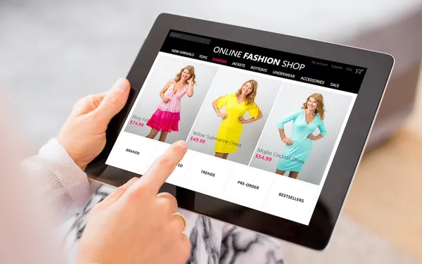
First impressions can make or break you, especially in this digital era. Your online audience won’t spare an extra second before switching to another website, however minor the issues are. Slow loading speed, too many ads and poor navigation are a few major turnoffs. It's essential that the "above the fold" portion of your website — the portion of the website that is visible once the page loads — is captivating enough to keep users hooked. To help, we have 5 tips for you to keep in mind as you improve your site. Check ’em out here!
Stay Consistent
One of the first things you can do to improve your conversion rate is to spend time maintaining message consistency. Oftentimes, a PPC ad for a particular product might be entirely different from the landing page a user is brought to by clicking on the ad. This is a much more common mistake than you might think, and can make potential buyers frustrated or confused, putting a stop to the conversion process — which is obviously not what you want!
People have limited patience, so it's important to find innovative ways to present your message to users quickly and efficiently.
The Call To Action
If you want more conversions, you need to realize that users want information fast. People have limited patience, so it's important to find innovative ways to present your message to users quickly and efficiently.
You want to provide solutions to your potential consumer pool as soon as they see your web page or an ad of your product online. It is here that you want to have a call to action (CTA) that's clearly visible and engaging; preferably at the exact time the page loads, without the need for scrolling.
You have to be careful when dealing with CTAs, as you need to make sure they catch the attention of the people visiting your website without going over the top. Additionally, a CTA must also do the job of convincing potential customers to follow steps to take action quickly.
Make your CTA attractive, and spend time to create buttons instead of a simple text link.
While creating a suitable CTA, keep in mind that your message should be written in a readable font and should have a natural tone. Your CTA should let your customers know about any benefits their purchase will provide. Make your CTA attractive, and spend time to create buttons instead of a simple text link.
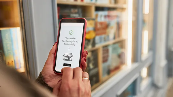
Visibility can make or break a CTA. Be cautious when placing your CTA on the page; it shouldn't get bogged down by tons of unwanted text. Most users prefer taking minimal action to complete the task they're set out to do. Try to keep your checkout process clean, without the hassle of loading too many pages or requiring a signup. Remember: user experience will always depend on the speed with which visitors can get the job done.
Keep Testing
Perfection takes practice — and so does website design. In this day and age, ecommerce has become extremely competitive, and the success of a business will directly depend on the quality of its website. It's important to keep optimizing and testing to ascertain the best version of your site.
The success of a business will directly depend on the quality of its website.
There are a number of analytics tools at your disposal that can guide you in assessing the performance of your website. One of the best ones out there is Google Analytics, which provides in-depth data about websites including bounce rate, sessions, conversions, page views and other consumer behavior metrics.
It's obvious that processing so much data is not an easy job and can be time consuming, which is why it can be beneficial to give A/B testing a try. This kind of testing allows you to assess various aspects of a given page at the same time.
One specific tool that can be very helpful is a heat map, which shows a visual representation of how users interact with your page and what are the areas or elements which attract the visitors. This information can be hugely beneficial in the long term, and will allow you to find out the loopholes in your web pages to improve your user experience.
The Right Headline
Coming up with the right headline is key, because it one of the first things on your site the bulk of visitors will see. Simple phrasing and word choice can have a dramatic affect on conversion rate.
Headlines that include the phrase “how to” will generally see an increase in interaction rate.
For example, headlines that include the phrase “how to” will generally see an increase in interaction rate. If you have a product or service that requires a bit of explanation, it's a good idea to create a "How To" page for a detailed explanation. It's also not a bad idea to check out your competitors and see the various elements they incorporate into their headlines and site pages to get some inspiration.
Offer Incentives
Offering freebies to your visitors can be a great way to increase conversions. Try providing exclusive access to other products of value — such as ebooks — to attract their attention. Concentrate on simple products that can be unique or convenient for your visitors. Knowing your customer base is really important here, since it will give you insight into the needs of your visitors.
Conclusion
Website conversions are (obviously!) an integral part of ecommerce, so developing strategies and ideas to increase them is important. Get creative when it comes to setting yourself apart from your competitors! From adding a visible CTA to offering freebies, there are plenty of ways to keep customers spending. Additionally, giving a pertinent headline will always benefit for your bottom line. And last but not least, keep on testing on improvements to your site. Conversions aren't hard to earn if you play your cards right and follow these tips!
Feel free to share any other strategies that have worked for you in the comments below!