Here’s how to build a custom Block for the VOLT Store that has dynamic layout and padding controlled through sliders in VOLT’s Site Designer. Learn to manage layout using Atomic CSS, Element’s AMP-ready CSS library.
By default, VOLT is configured to show AMP (Accelerated Mobile Pages), a way of helping websites like your VOLT Store load quickly on mobile devices. Since speed is a ranking factor for Google search ranking, VOLT offers SEO benefits to your ecommerce store through its best-in-class speed.
AMP pages specifically will show up in users’ Google search results on mobile.
Since increased speed means increased revenue, VOLT is built to be lightning-fast. It achieves this performance through the use of Atomic CSS.
Atomic CSS is Element’s built-in cascading stylesheets (CSS) library. It offers tiny file sizes (meaning fast load times) and human-readable CSS class names.
Using Atomic CSS helps you keep the total amount of CSS loaded by your VOLT Store under the 50KB limit for CSS for AMP pages.
This article will explain how you can dynamically control Atomic CSS classes in a custom Block built with Element for use in the VOLT Store.
Element uses Atomic CSS, a layout-focused CSS library that is designed for optimum performance on VOLT storefronts.
When building a custom Block with Element, you use Atomic CSS to select CSS styles for layout properties like position, spacing, height, and width.
Atomic CSS is based on the Tachyons CSS library, but it only keeps certain parts of that library in order to minimize file size. This helps stay under the 50KB limit for CSS on AMP pages.
Atomic CSS offers precise control over many CSS properties, based on a “factor of 2” scale from 0.25rem to 16rem. The complete reference can be found over in the element-atomic-css GitHub repository, especially the atomic.css file, which lists all classes available in Atomic CSS.
This article will show you how to combine Atomic CSS with Aphrodite, Element’s built-in “CSS-in-JS” (or “JSS”) library for handling custom styles.
Using Aphrodite, you will set custom background colors, border styles, and font size.
This article helps to illustrate what can be selected from Atomic CSS (layout classes) compared to what needs to be configured as Aphrodite custom styles (colors, fonts, and borders).
In addition to the Atomic CSS classes, this article will help you become more familiar with multiple Element Proptypes. This Block uses the following Element Proptypes:
The “sectionHeader” Proptype to mark the sections of t he configuration.
The “color” Proptype to select the background gradient colors and font color.
The “slider” Proptype to select border width, border radius, and Atomic CSS classes.
The “bool” Proptype to toggle a box shadow effect on and off.
The “oneOf” Proptype to offer a dropdown menu with pre-filled text choices.
The “string” Proptype to fill in the text for the second text field.
The “number” Proptype to set the font size in rem units (“root em” CSS length units).
Combining these Proptypes lets you provide the user with the ability to customize the custom Block from within VOLT’s Site Designer.
This is the complete list of options that the user will be able to control in Site Designer:

For information on how each Proptype works, please see the previous article Element Proptypes Explained for Custom Blocks in the VOLT Store.
You should understand the basics of how to create and publish an Element Block before beginning this tutorial.
If you would like to learn how to build Blocks from scratch, please take some time to complete the “Building An Element Page Tutorial” (about 15 min).
There is also a helpful series of YouTube videos to teach you how to use Element over at “Element Tutorial | VOLT Learning Center” (27 min).
For more information on using CSS in Element, please refer to the sections Atomic CSS Framework, Styling Your Block With CSS, and Style A Block with Aphrodite from the Element Platform Documentation.
To familiarize yourself with the use of Atomic CSS and especially its padding and margin controls, you may want to read the previous article “How to Make a Hero Image Modal Block using Atomic CSS” before continuing.
Other tutorials have discussed using Aphrodite for creating custom CSS classes when building in custom Blocks using Element. For more information on using Aphrodite, please read the previous articles on dynamic selection of font sizes or font faces using Element.
Finally, you will need to be authorized to develop custom Blocks in order to continue with this tutorial. Instructions can be found at the “How To Get Approved To Develop Blocks” page in the Element Platform Documentation.
This tutorial will use classes primarily from Atomic CSS’s flexbox.css, spacing.css, and width.css files. Some of the Atomic CSS classes that will be used are:
.flex-wrap {flex-wrap: wrap;}

.items-center {align-items: center;}

.pv2 {
  padding-top: 0.5rem;
  padding-bottom: 0.5rem;
}

.ph3 {
  padding-left: 1rem;
  padding-right: 1rem;
}
You will also be using the breakpoint selectors for Atomic CSS with creating different mobile and desktop website designs. The breakpoints used are:
.w-100 {width: 100%}
  Small (the default), <30em width

.w-40-l {width: 40%}
  Large, >60em width
There are two other breakpoints not used in this tutorial:
.pa0-ns {padding: 0;}
  Not small, >30em width

.pa0-m {padding: 0;}
  Medium, >30em & <60em width
For more information on handling breakpoints, please refer to Justin Tomich’s blog post about Tachyons, the framework Atomic CSS is built-on.
In the next section, you will start building a custom Block that will use sliders to configure the width and padding classes from inside VOLT’s Site Designer.
Using the Element Command Line Interface (CLI), make a new Block called “Dynamic Layout Block.”
First, if necessary, login to the Element CLI using the username and password that you use with VOLT’s Site Designer:
element login
Then run the following terminal commands in the directory where you keep your Element Blocks.
element new DynamicLayoutBlock
cd DynamicLayoutBlock
npm install
Now, you will need to initialize the Git repository in the Block’s directory with the terminal commands:
git init
git add -A
git commit -am "Initial Commit"
You might want to publish your repository online (to GitHub) as a backup before continuing.
This custom Block will offer a lot of props that will be configurable by the user of the Block in VOLT’s Site Designer.
You set up these props using the previously-mentioned Element Proptypes in the /src/configs.js file. Replace the contents of that file with this code:
import { ElementPropTypes } from "@volusion/element-proptypes"
export const configSchema = {
section1: {
type: ElementPropTypes.sectionHeader,
},
backgroundColorCenter: {
label: "Background Color (Center)",
type: ElementPropTypes.color,
},
backgroundColorOutside: {
label: "Background Color (Outside)",
type: ElementPropTypes.color,
},
section2: {
type: ElementPropTypes.sectionHeader,
},
borderColor: {
label: "Border Color",
type: ElementPropTypes.color,
},
borderWidthSlider: {
label: "Border Width (px)",
type: ElementPropTypes.slider,
},
borderRadiusSlider: {
label: "Border Radius (px)",
type: ElementPropTypes.slider,
},
boxShadow: {
label: "Box Shadow (on/off)",
type: ElementPropTypes.bool,
},
section3: {
type: ElementPropTypes.sectionHeader,
},
headingFlexboxPercentSlider: {
label: "Heading Flexbox Percentage on Large Screens",
type: ElementPropTypes.slider,
},
paddingLeftRightSlider: {
label: "Padding Left & Right (0-16rem)",
type: ElementPropTypes.slider,
},
paddingTopBottomSlider: {
label: "Padding Top & Bottom (0-16rem)",
type: ElementPropTypes.slider,
},
section4: {
type: ElementPropTypes.sectionHeader,
},
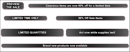
heading: {
label: "Heading Text",
type: ElementPropTypes.oneOf([
"LIMITED TIME ONLY",
"SALE ENDING SOON",
"LIMITED QUANTITIES",
"ACT FAST! NEW MARKDOWNS",
"PREVIEW THE SALE",
"(Turn off heading)",
]),
},
text: {
label: "Subheading Text",
type: ElementPropTypes.string,
},
color: {
label: "Font Color",
type: ElementPropTypes.color,
},
fontSize: {
label: "Font Size (rem)",
type: ElementPropTypes.number,
},
}
export const defaultConfig = {
section1: "Background Gradient",
backgroundColorCenter: "rgba(0,0,0,1)",
backgroundColorOutside: "rgba(100,100,100,1)",
section2: "Border Styles",
borderColor: "rgba(255,209,220)",
borderWidthSlider: {
labelPrefix: "",
labelStepSize: 5,
labelSuffix: "px",
min: 0,
max: 10,
stepSize: 1,
selectedValue: 3,
vertical: false,
},
borderRadiusSlider: {
labelPrefix: "",
labelStepSize: 5,
labelSuffix: "px",
min: 0,
max: 50,
stepSize: 5,
selectedValue: 30,
vertical: false,
},
boxShadow: true,
section3: "Box Spacing Options",
headingFlexboxPercentSlider: {
labelPrefix: "w-",
labelStepSize: 10,
labelSuffix: "-l",
min: 0,
max: 100,
stepSize: 10,
selectedValue: 40,
vertical: false,
},
paddingLeftRightSlider: {
labelPrefix: "ph",
labelStepSize: 1,
labelSuffix: "",
min: 0,
max: 7,
stepSize: 1,
selectedValue: 5,
vertical: false,
},
paddingTopBottomSlider: {
labelPrefix: "pv",
labelStepSize: 1,
labelSuffix: "",
min: 0,
max: 7,
stepSize: 1,
selectedValue: 2,
vertical: false,
},
section4: "Sale Banner Text",
heading: "LIMITED TIME ONLY",
text: "50% Off Sale Items",
fontColor: "rgba(255,255,255,1)",
fontSize: 2.5,
}
In this case, the user will have control over the background gradient colors, Atomic CSS classes, font color and size, and the text for each of two heading elements.
The user of VOLT Site Designer will have access to color pickers, slider controls, drop-down menus, string fields, and numeric controls because of the use of Element Proptypes. For more information, please refer to the Element Platform Documentation’s list of all Element Proptypes. Specifically, the “slider” Element Proptype is used to control the Atomic CSS classes, as you will see in the next section.
The custom Block itself combines Atomic CSS and Aphrodite styles and inserts the various props configured in the last file.
Open up /src/Block.js and replace the entire file with this code:
import React from "react"
import { css, StyleSheet } from "aphrodite/no-important"
import { getStyles } from "./getStyles"
import { defaultConfig } from "./configs"

const Block = (props) => {
  const classes = StyleSheet.create(getStyles(props))
  const {
	joinClasses, // Helper function to combine Aphrodite & Atomic CSS classes
	heading,
	text,
	headingFlexboxPercentSlider,
	paddingLeftRightSlider,
	paddingTopBottomSlider,
  } = props

  // Extract the Atomic CSS classes for the spacing options
  const headingFlexBoxPercent = headingFlexboxPercentSlider.selectedValue // e.g. 40 for w-40-l
  const paddingLeftRight = paddingLeftRightSlider.selectedValue // e.g. 5 for ph5
  const paddingTopBottom = paddingTopBottomSlider.selectedValue // e.g. 2 for pv2

  // Handle the case where the user has turned off the heading box
  let showHeading = true
  let textFlexBoxPercent = 100 - headingFlexBoxPercent // e.g. 60 for w-60-l
  if (heading === "(Turn off heading)") {
	showHeading = false
	textFlexBoxPercent = 100 // e.g. 100 for w-100-l
  }

  return (
	<div className="flex flex-wrap items-center self-center justify-center tc">
  	{showHeading && (
    	<div
      	className={`w-100 w-${headingFlexBoxPercent}-l ph${paddingLeftRight} pv${paddingTopBottom}`}
    	>
      	<h1
        	className={joinClasses(
          	`ph${paddingLeftRight} pv${paddingTopBottom}`,
          	css(classes.banner)
        	)}
      	>
        	{heading}
      	</h1>
    	</div>
  	)}
  	<div
    	className={`w-100 w-${textFlexBoxPercent}-l ph${paddingLeftRight} pv${paddingTopBottom}`}
  	>
    	<h2
      	className={joinClasses(
        	`ph${paddingLeftRight} pv${paddingTopBottom}`,
        	css(classes.banner)
      	)}
    	>
      	{text}
    	</h2>
  	</div>
	</div>
  )
}

Block.defaultProps = defaultConfig
export default Block
There are several levels of dynamic functionality provided. First, if the heading prop has the value of "(Turn off heading)" then the heading <div> element will not be shown.
When there is a heading, the width of its <div> element on large screens is set in the “headingFlexBoxPercent” prop, whose value is inserted as an Atomic CSS class (such as “w-40-l”). The text has the opposite value to take up the whole space (such as “w-60-l”).
On small screens, both <div> elements have 100% width, because of the “w-100” class.
The Block provides dynamic control of the padding CSS attribute (e.g. “ph2” and “pv3”) using Atomic CSS classes from the previously-mentioned spacing.css file.
The <div> elements also have CSS flexbox settings, set using classes from the flexbox.css file.
For the complete list of all CSS classes contained in Atomic CSS, please see the atomic.css file in the element-atomic-css GitHub repository.
The props that have not yet been used in the Block are used to set custom CSS styles, as discussed in the next section.
Open up /src/getStyles.js and replace its contents with the following code:
export const getStyles = (blockConfig) => {
  const {
	backgroundColorCenter,
	backgroundColorOutside,
	borderColor,
	borderWidthSlider,
	borderRadiusSlider,
	boxShadow,
	fontColor,
	fontSize,
  } = blockConfig
  const borderRadius = borderRadiusSlider.selectedValue
  const borderWidth = borderWidthSlider.selectedValue

  const returnObject = {
	banner: {
  	background: `radial-gradient(circle, ${backgroundColorCenter} 0%, ${backgroundColorOutside} 100%)`,
  	borderColor: borderColor,
  	borderRadius: `${borderRadius}px`,
  	borderStyle: "solid",
  	borderWidth: `${borderWidth}px`,
  	color: fontColor,
  	fontSize: `${fontSize}rem`,
	},
  }
  if (boxShadow) {
	returnObject.banner.boxShadow = "3px 6px #888888"
  }

  return returnObject
}
This file creates custom CSS classes for the Block using Aphrodite, Element’s JSS library.
For the “slider” Element Proptypes, the values are extracted from the “selectedValue” property of each of the sliders.
The background color is set as a radial-gradient using the two colors selected by the user in VOLT’s Site Designer.
The boxShadow is configured as a boolean (true-or-false) value, though the user could be provided additional configuration options for this or any other CSS styles.
The Block is now complete and can be tested on your local computer.
Before publishing, launch the custom Block locally so you manually test its functionality.
Launch the local development server with the npm start (npm run start) command:
npm run start
This should open up a new browser window pointing to http://localhost:4000/ so you can inspect the custom Block.
Next, you can modify the local props, and the changes will be shown in the custom Block.
Changing the local props will check that the props set by the user will successfully change the behavior of the custom Block.
Changing the local environment props will let you test the Block locally, observing the effect on the Block when you edit its props.
Open the file /local/index.js and replace the line const localEnvPropOverrides = { … } with the following code:
const localEnvPropOverrides = {
  // heading: "PREVIEW THE SALE",
  // heading: "LIMITED QUANTITIES",
  // Change to this line to turn off the heading:
  heading: "(Turn off heading)",
  // text: "Act now while supplies last!",
  // text: "Clearance items are now 80% off for a limited time",
  text: "Brand new products now available",
  headingFlexboxPercentSlider: { selectedValue: 50 },
  paddingLeftRightSlider: { selectedValue: 3 },
  paddingTopBottomSlider: { selectedValue: 1 },
}
Save the file, then view the Block in the local browser again, using npm start.
The local environment props have the heading turned off, so you should only see one <div> when you load the custom Block locally.
You can try adding other props, like the “boxShadow” prop, in the configuration to manually test how the Block behaves. The code example has comments with alternative text for you to try.
The slider props need to be set as objects with a selectedValue property, as shown.
Try reloading the http://localhost:4000 page after updating the /local/index.js file if you do not see immediate changes in the web browser.
You will need unit tests for the custom Block before you can use it in VOLT’s Site Designer.
To test out the custom Block in VOLT’s Site Designer, you need to publish your custom Block. This will make it available to use in your VOLT Store. To publish, the Block’s tests must pass.
Open /__tests__/Block.spec.js and replace the code with:
import React from "react"
import { mount } from "enzyme"
import {
  mockUtils as utils,
  joinClasses,
} from "@volusion/element-block-utils/test-utils"
import { block as Block, defaultConfig } from "../src"

let props
describe("The Block", () => {
  beforeEach(() => {
	props = {
  	data: {},
  	utils,
  	joinClasses,
  	queryParams: {},
	}
  })
  it("renders without errors", () => {
	mount(<Block {...props} />)
  })
  describe("when there is no custom data", () => {
	it("should render the block with the default content", () => {
  	const wrapper = mount(<Block {...props} />)
  	expect(wrapper.text()).toBe(defaultConfig.heading + defaultConfig.text)
	})
  })
  describe("when given custom data", () => {
	it("should render the block using the custom data", () => {
  	const customHeading = "Custom Block Heading"
  	const customText = "Custom Block Text"
  	const wrapper = mount(
    	<Block {...props} heading={customHeading} text={customText} />
  	)
  	expect(wrapper.text()).toBe(customHeading + customText)
	})
	it("should render only the text when heading is off", () => {
  	const customHeading = "(Turn off heading)"
  	const customText = "Custom Block Text"
  	const wrapper = mount(
    	<Block {...props} heading={customHeading} text={customText} />
  	)
  	expect(wrapper.text()).toBe(customText)
	})
  })
})
To run the tests, enter the terminal command npm run test:
npm run test
This code only tests the display of the text in the two <div> elements of the Block, including the option to turn off the heading through the selection of “(Turn off heading)” in the dropdown menu.
The current tutorial will not cover testing the CSS styles applied dynamically, but it would be easy to add those unit tests to improve the reliability of your code.
To learn how to test the CSS of the Block, please read the previous article How to Unit Test CSS in a Custom Block in Element.
To test the AMP (Accelerated Mobile Pages) version of the custom Block, copy the same code into the /__tests__/AMP.spec.js file. Change line 14 from “utils: {},” to:
utils: { ...utils, isAmpRequest: true },
This change will cause that unit test to render the AMP Block instead of the regular version.
Once you are finished with both test files, you can build and publish custom Block.
To publish the custom Block, stop the local development server (npm start) by using Ctrl+C to terminate the running process.
Build the Block using the npm run build command:
npm run build
Next, you will use the element publish command from the Element CLI to publish the Block:
element publish -n "Dynamic Layout Block"
Use the required -n flag (for “name”) to give the Block a name, which needs to be in quotes. You will be prompted to select the category for the Block using your arrow keys. Choose Misc and hit the Enter key.
You might notice a warning message about a missing “thumbnail.png” file. This happens if you do not have a thumbnail image for the custom Block’s preview in VOLT’s Site Designer.
For instructions on how to add a thumbnail image, please watch the YouTube video How to Create a Thumbnail for Your Block | Element Tutorial | VOLT Resource Center (4 minutes) or read about the Element CLI’s publish command in the Element Platform Documentation.
Having published the new custom Block, you can create a new theme to use as a sandbox, which will let you try out the Block in VOLT’s Site Designer. Themes house the Pages inside of VOLT, and a new theme will be an isolated workspace for you to test out the custom Block.
To make a new theme, click the + Create New Theme link inside of VOLT’s Site Designer, located to the right of Inactive Themes. Enter “Dynamic Layout Block Test” as the Theme Name, then click the Create button to create the theme.
If VOLT’s Site Designer happens to open up to the store’s active theme, first click the Change Theme link at the top-left of the screen (located next to the current theme name). This will take you back to the screen where you can create a new theme.
The homepage of the new theme is empty other than a header and footer section by default.
To add the new custom Block to the homepage, click the plus sign (+) above the text that reads Add Block, then click Misc in the left-hand sidebar.
In that list, find the custom Block, then click the Add Block button.
To customize the props used by the custom Block, click on the newly-added Block to select it for editing. Be sure to click the Done button at the bottom of the sidebar to save your changes.
You can preview the new homepage with the Preview button at the top-left of Site Designer. This will take you to the most current preview version of the VOLT store, at a link that looks like:
https://preview-your-volusion-store.myvolusion.com/
The new custom Block is still in development (or “staging”) so will not be shown if you were to click the Publish button in VOLT’s Site Designer. The next section describes updating the Block and releasing the Block from staging to production.
When you have made changes to the custom Block that you want to test in VOLT’s Site Designer, you need to rebuild the custom Block with npm run build. Once built, you can update the minor version of the Block using the element update command:
npm run build
element update
Minor versions update the preview of the Block inside VOLT’s Site Designer. For more information, please refer to How To Track Block Versions in the Element Platform Documentation.
When you first publish or update the custom Block, it is in staging, only visible on the preview version of the VOLT Store in Site Designer.
To release the custom Block, making it live on all public VOLT Stores using that Block, use the terminal command element release with the -n “Notes” flag:
element release -n "This Version's Release Notes"
Note that the release notes need to be in quotes. Release notes are highly recommended.
The release command will then ask you to confirm on the command line (Enter “Y” for yes or “n” for no). Once you release, the new Block takes effect immediately on the stores that have the custom Block installed.
This command will release the first version (V1) of the custom Block. For more information, please refer to the Element Platform Documentation’s section on the Element CLI’s release command.
It is recommended that you track the version release using Git. Enter the commands int your terminal:
git commit -am "Version 1.0"
git tag 1.0
Furthermore, you might want to work from new Git branches when developing a publicly-released version.
VOLT’s flexible development options allow you to provide the user fine-grained control, even over which Atomic CSS classes are applied to a custom Block. Atomic CSS can be controlled using Element Proptypes by inserting the props as parts of CSS classnames, as shown in this tutorial. Specifically, you managed the Atomic CSS classnames in the /src/Block.js file using the props. In this case, these classnames were configured as a “slider” Element Proptype. Alternatively, you could imagine using the “string” or “oneOf” (dropdown menu) Proptypes to store the values for managing the Atomic CSS classnames.
The “Dynamic Layout Block” from this article is a useful way of understanding how to combine Aphrodite custom styles with Atomic CSS classes when building Element Blocks for VOLT.
You saw how font, border, and background styles need to be controlled using Aphrodite custom classes. Atomic CSS is focused on layout issues, such as padding, width, and flexbox .
To learn more about what you can control with Atomic CSS, the Element Platform Documentation has a list of all built-in Atomic CSS classes available in Element.